A massive wind energy project was being planned right in our backyard here in the Dalstorp and Grönahög areas.
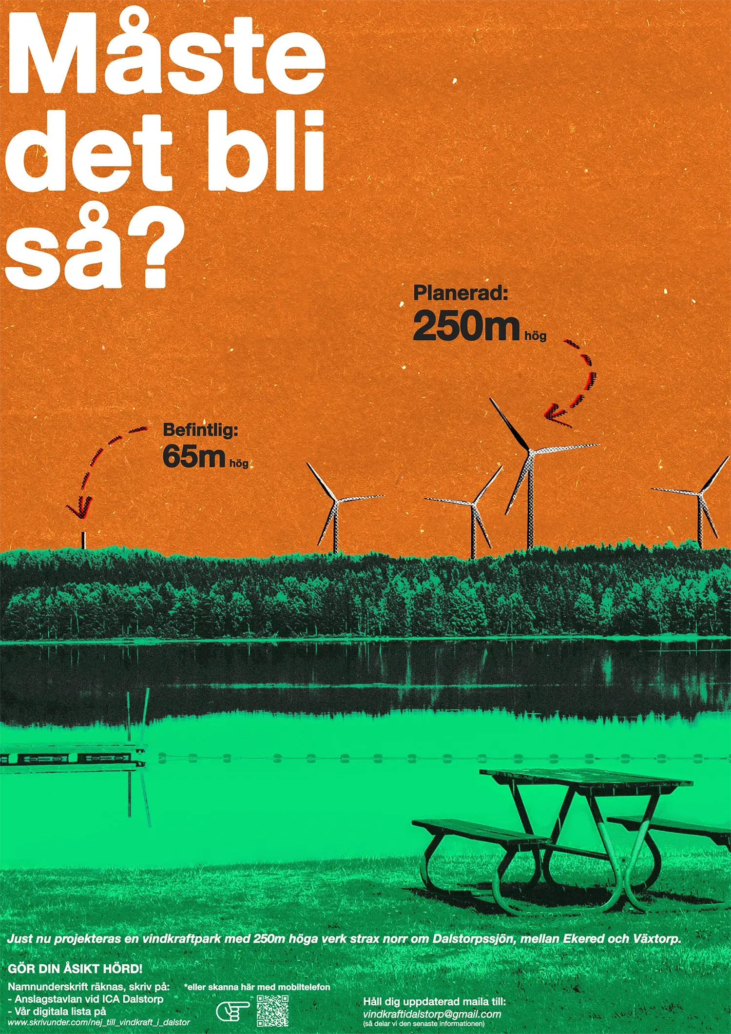
The proposal outlined giant wind turbines reaching up to an industrial scale of 250 meters.
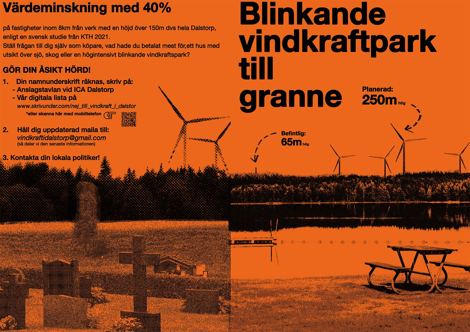
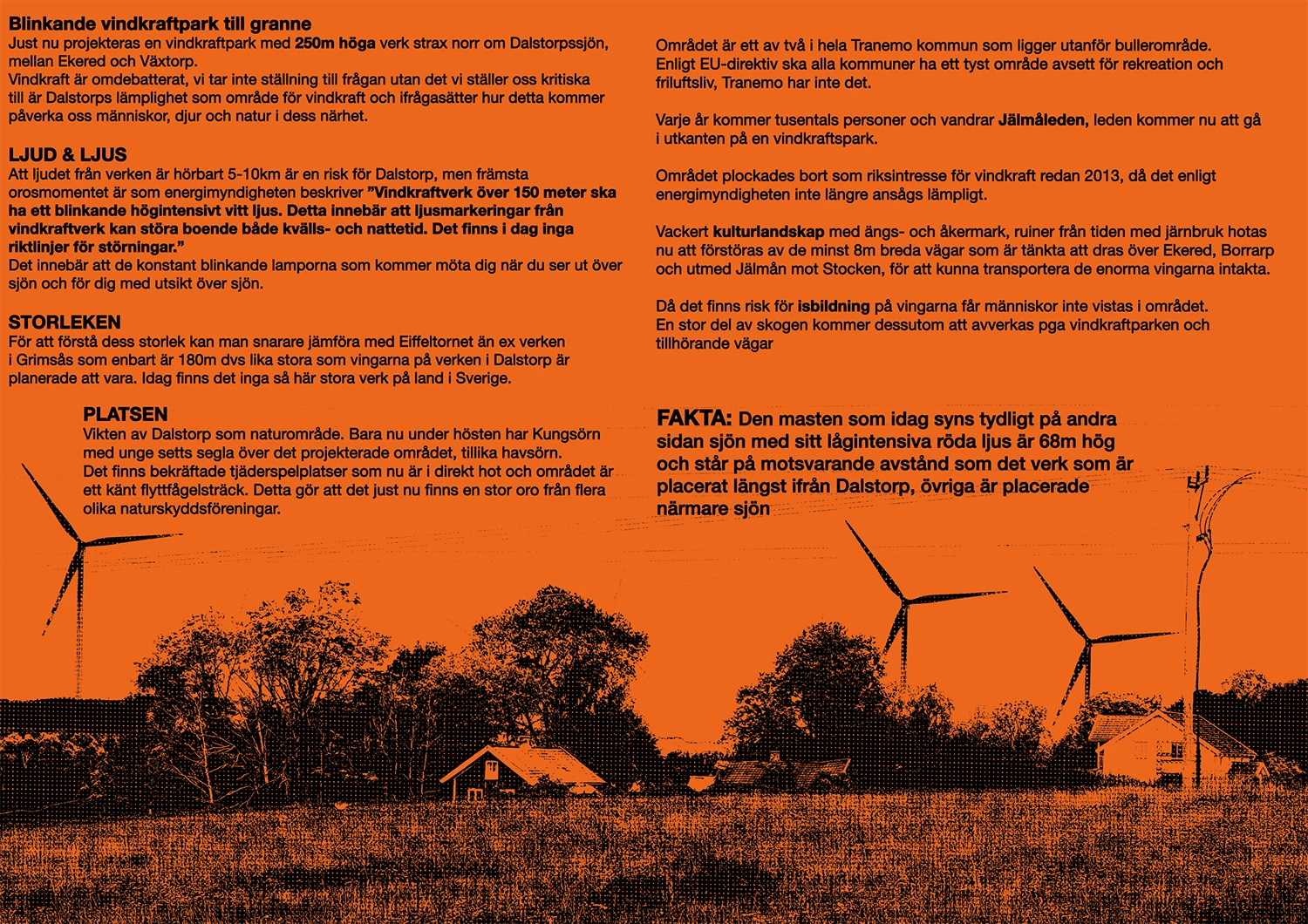
If approved, these structures would completely alter the mostly untouched landscape, introduce constant noise pollution, create an invasive flashing light disturbance at night, and trigger an estimated 40% drop in local property values.
Our friend and neighbor approached me to see if I could help the local grassroots movement by designing a poster and an informational brochure to drive a petition campaign.
This was an entirely self-funded community initiative, meaning the design had to be incredibly budget-friendly to print in high volumes.
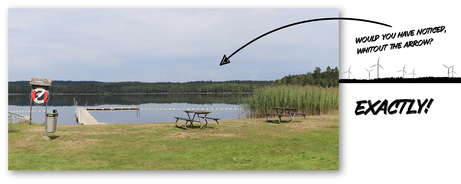
Visualizing the true scale of wind turbines on a typical landscape photo is notoriously difficult.
White lines (the turbines) against a backdrop of light blue sky or dense forests would blend right in with the background.
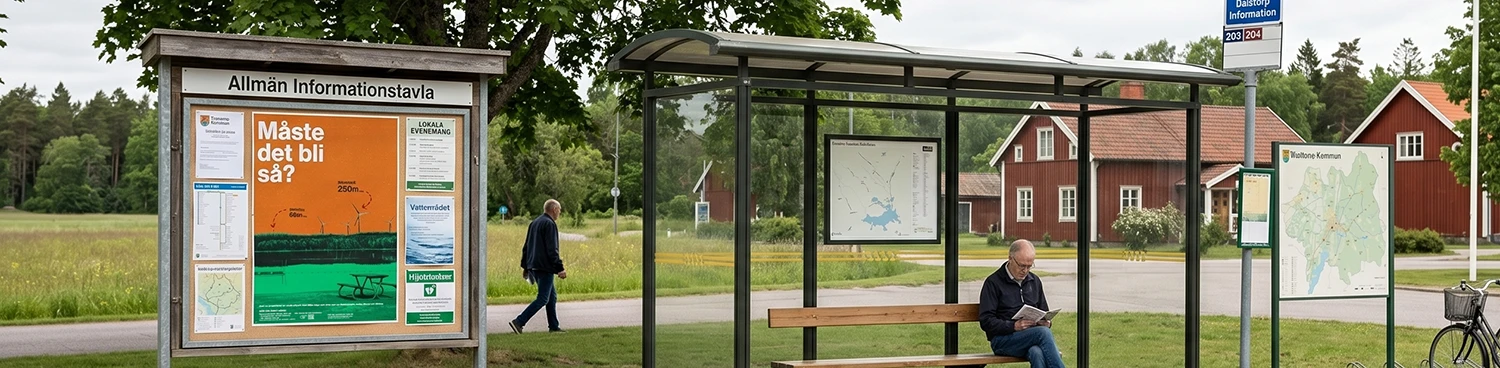
The print materials needed to cut through the usual clutter of standard local notice boards and community advertisements.
Also we needed something instantly legible and meaningful for the 60+ demographic, who make up a massive portion of our local population, while keeping it visually engaging enough so younger residents wouldn’t just walk past it..
I was provided photos of the affected local landscapes with rough scale markers.
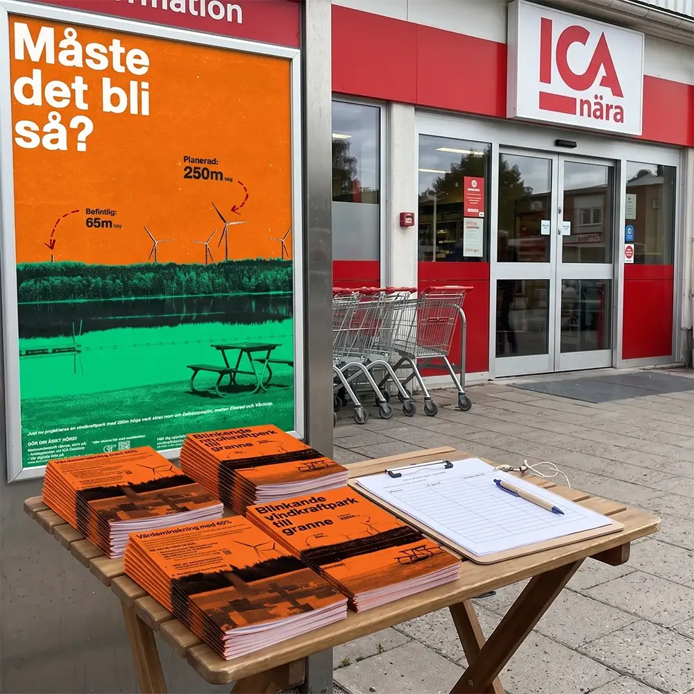
In Photoshop, I built out the planned 250-meter turbines to their approx. proportions. To make the actual size understandable for everybody, they pose against existing 65-meter masts, making the looming threat undeniable.
To solve both the visual challenge and create something catching for all age groups, I went with a bold, stylized halftone matrix.
I separated the image components into a high-contrast, screen-printed aesthetic.
This look solved multiple problems at once.
The bold halftone print felt nostalgic and familiar to the older generation, while the younger crowd instantly recognized it as a trendy “retro” look. Printed in bright, contrasting colors and clearly pointing out the problem visually.
To make the viewer not just walk by, he is asked a question, highlighted in fat letters:
Does it have to be like this?

Economically, this approach was a massive win.
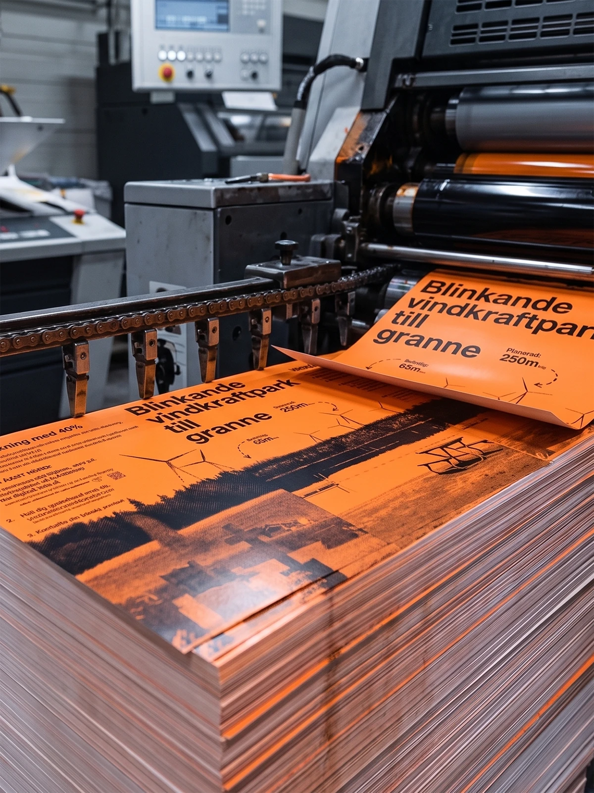
It allowed us to run a highly cost-effective 1-color (1c) print process for the informational flyers, printed on bright orange, matte paper, and a simple 3-color (3c) process for the large posters, contrasting in the same orange to a bright, highly visible green.
While the printing costs remained at a minimum, due to the large numbers of prints and the truly bright colors, no other local ad would show, the visibility was immense!
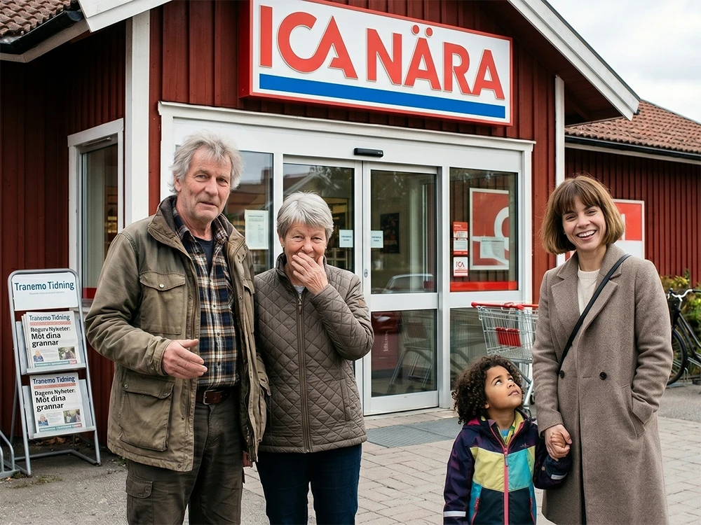
We saturated the region with this campaign, placing the large posters at high-traffic touchpoints across the entire Tranemo municipality and setting up flyer distribution stands at essential community hubs, such as the local ICA supermarket in Dalstorp.
The grassroots action was a total triumph.
We collected far more than enough signatures to be heard by the local government, resulting in the Tranemo municipality officially canceling the entire wind farm project.
Because of this collective effort, Dalstorp and its surroundings can proudly maintain their official designation as a “tyst område”
(quiet area), protecting local wildlife, preserving property integrity, and continuing to welcome peaceful nature tourism for years to come.