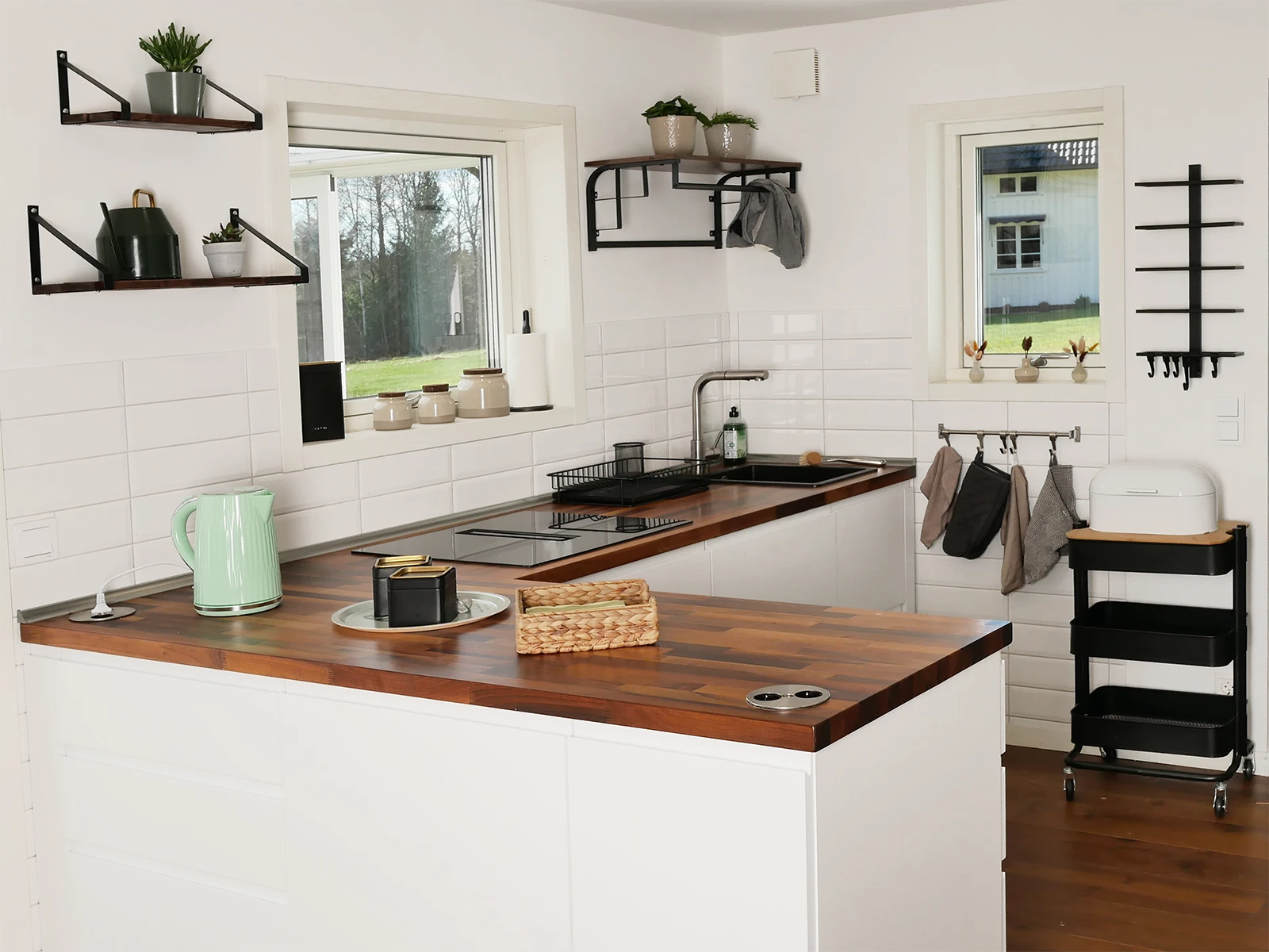
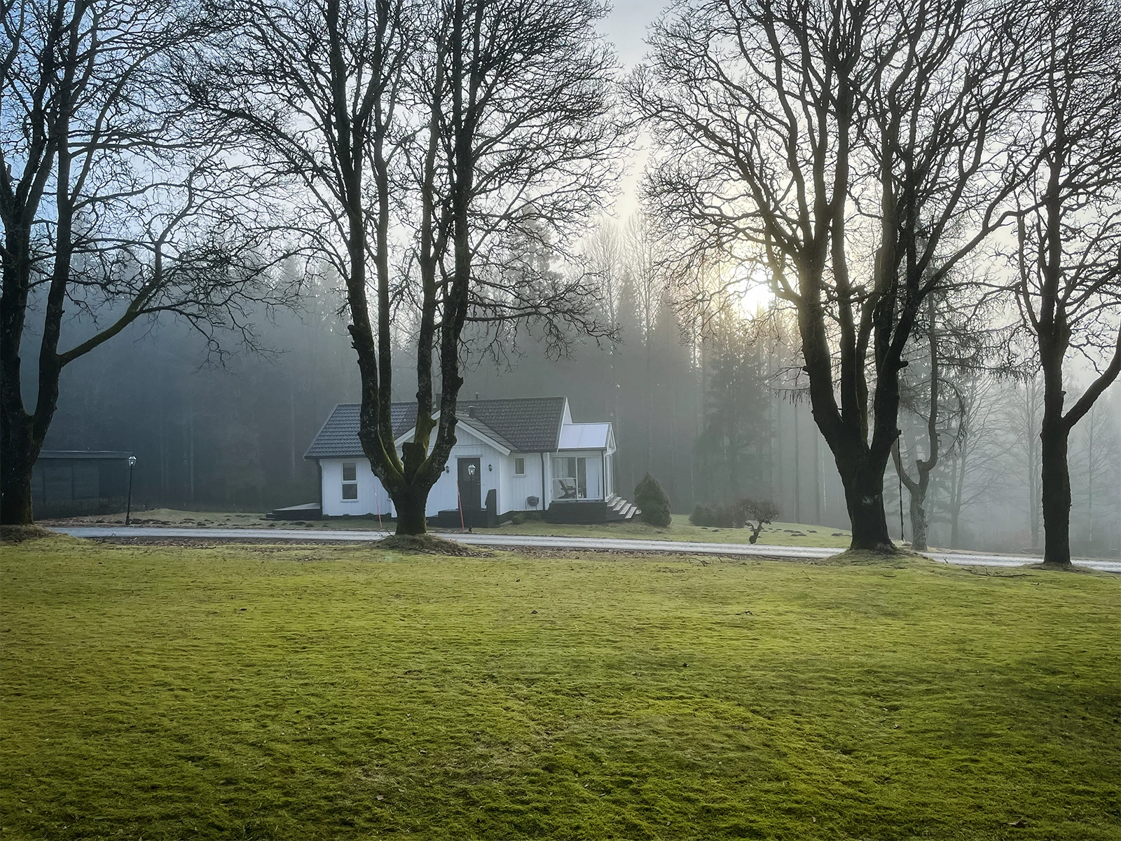
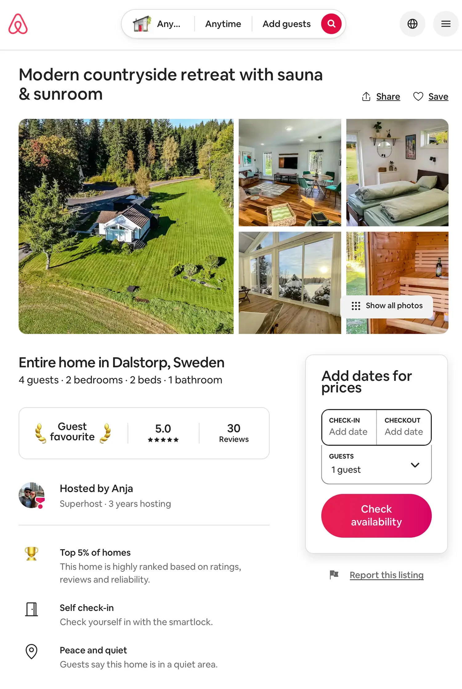
Having a standalone 53 sqm guesthouse on our property in rural Sweden, I decided to completely renovate, modernize, and expand it to 65 sqm between 2022 and 2023. Initially, it served simply as a place for visiting family and friends to stay.
When I made the decision to convert the property into an Airbnb in December 2024, my market research revealed a glaring gap: almost all competing listings in Sweden completely lacked a cohesive concept and suffered from poor, uninspired photography.
I knew I could do better than that. To stand out in a crowded market, the property simply required a well-thought-out visual identity and high-quality presentation.
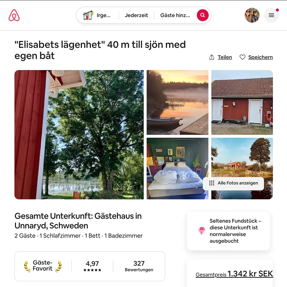
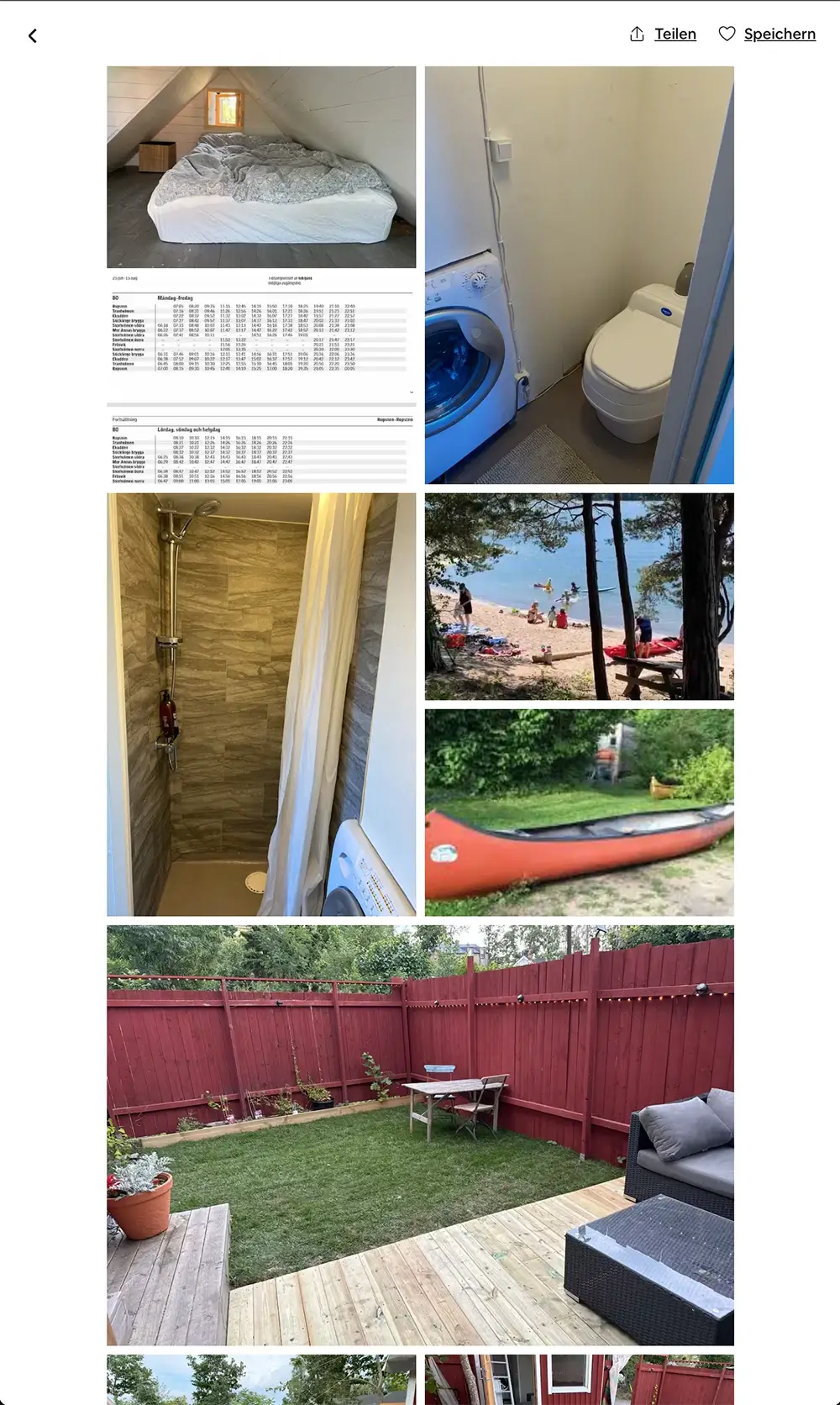
Despite a cryptic cover photo, poor image quality, and mismatched furniture, it remains a rare find, a “Guest Favorite,” and consistently fully booked. The sole reason? It‘s sitting directly on a lake with private access…
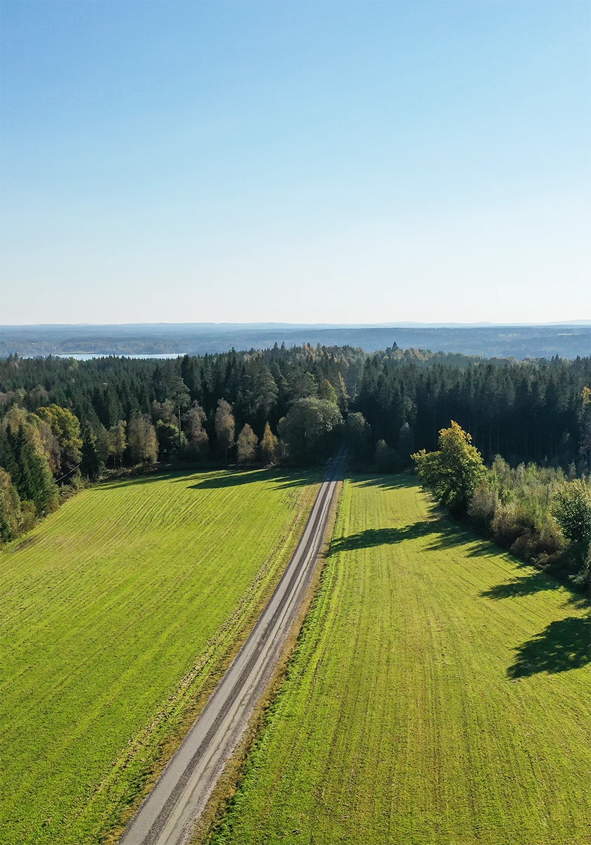
While our guesthouse is incredibly idyllic, it is not located lakeside—which is usually a massive selling point in the Swedish vacation market. To compensate for this, the listing needed a distinct, visual aesthetic that would make it stand out among other listings with superior locations.
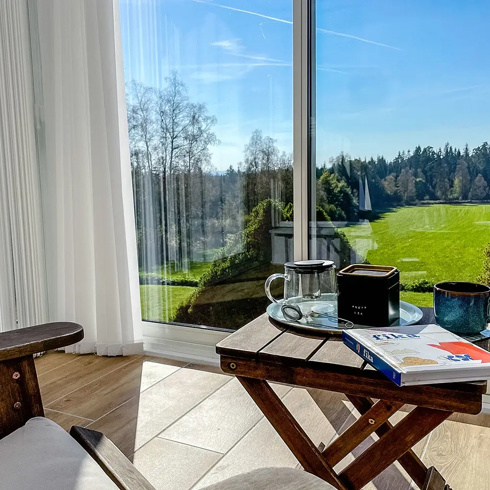
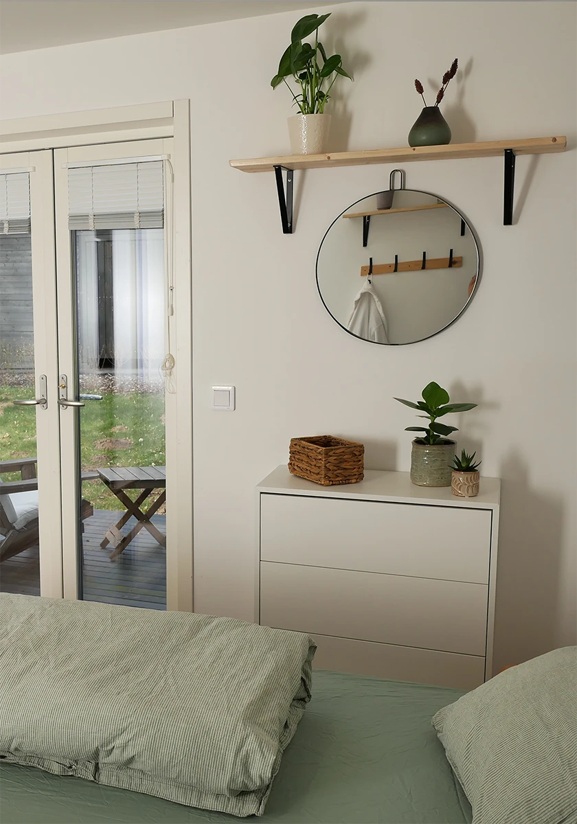
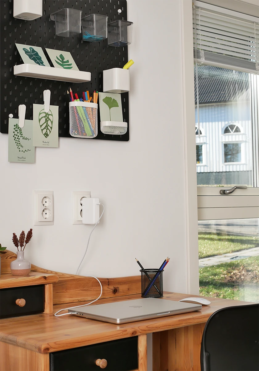
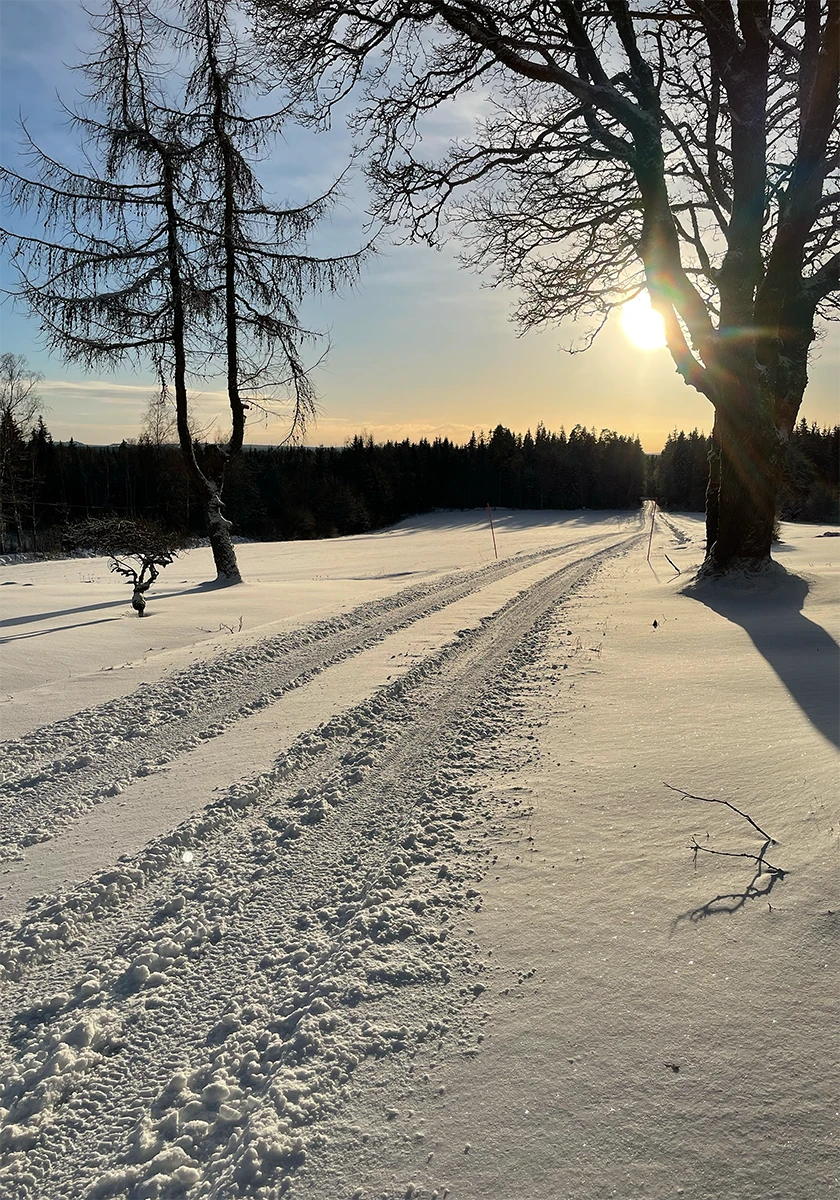
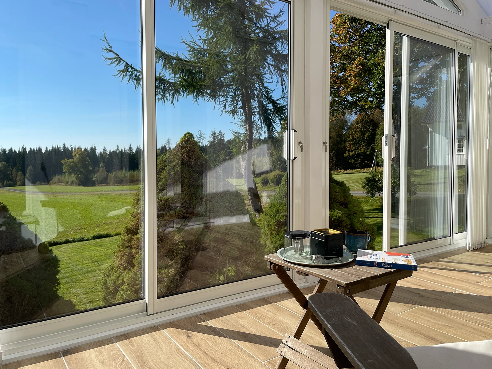
The photos are a mix of iPhone captures for the interior, a Lumix camera for the finer details, and aerial drone footage to highlight the surrounding grounds—covering every season to give potential guests a better impression of what to expect during their stay.
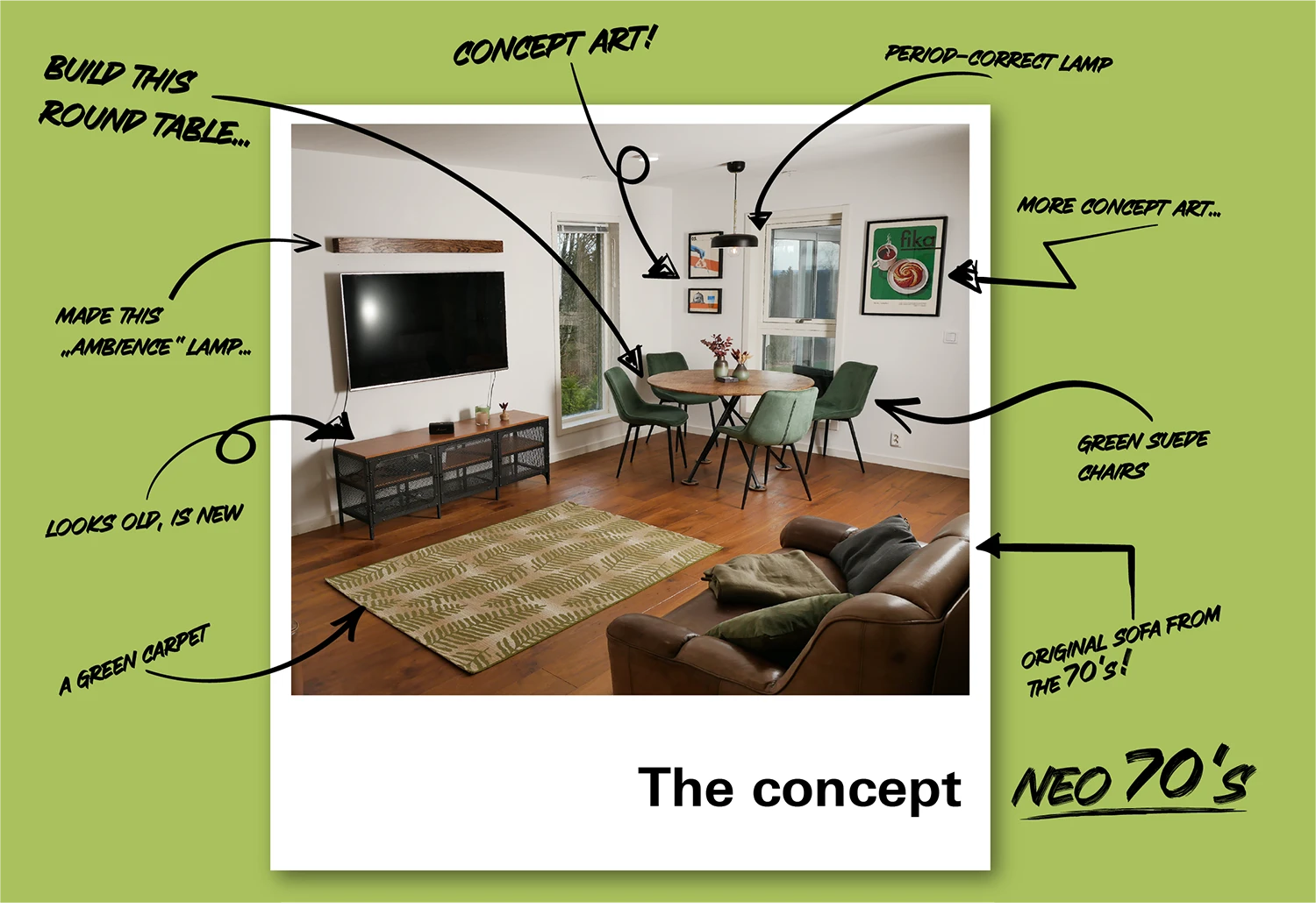
The “neo-70s” aesthetic is meant to blend naturally in with the landscape, and perfectly complements the property’s contemporary kitchen and bathroom.
To let this listing stand out a bit more, it required a unique visual identity to hold its own against properties with better locations.
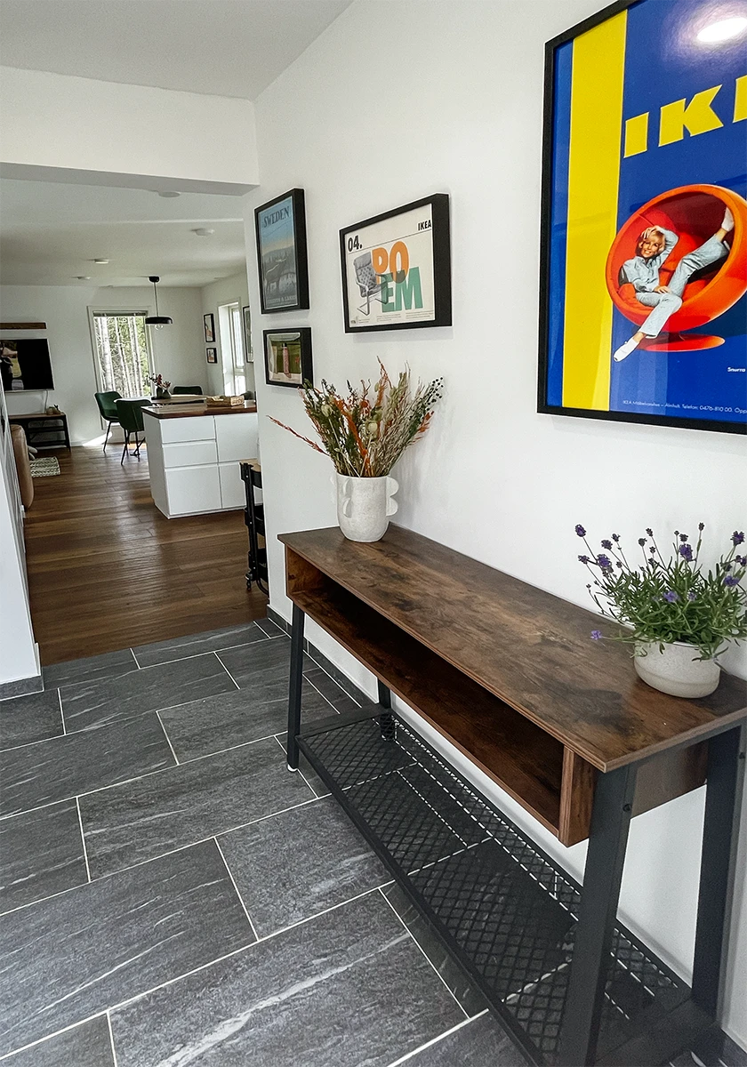
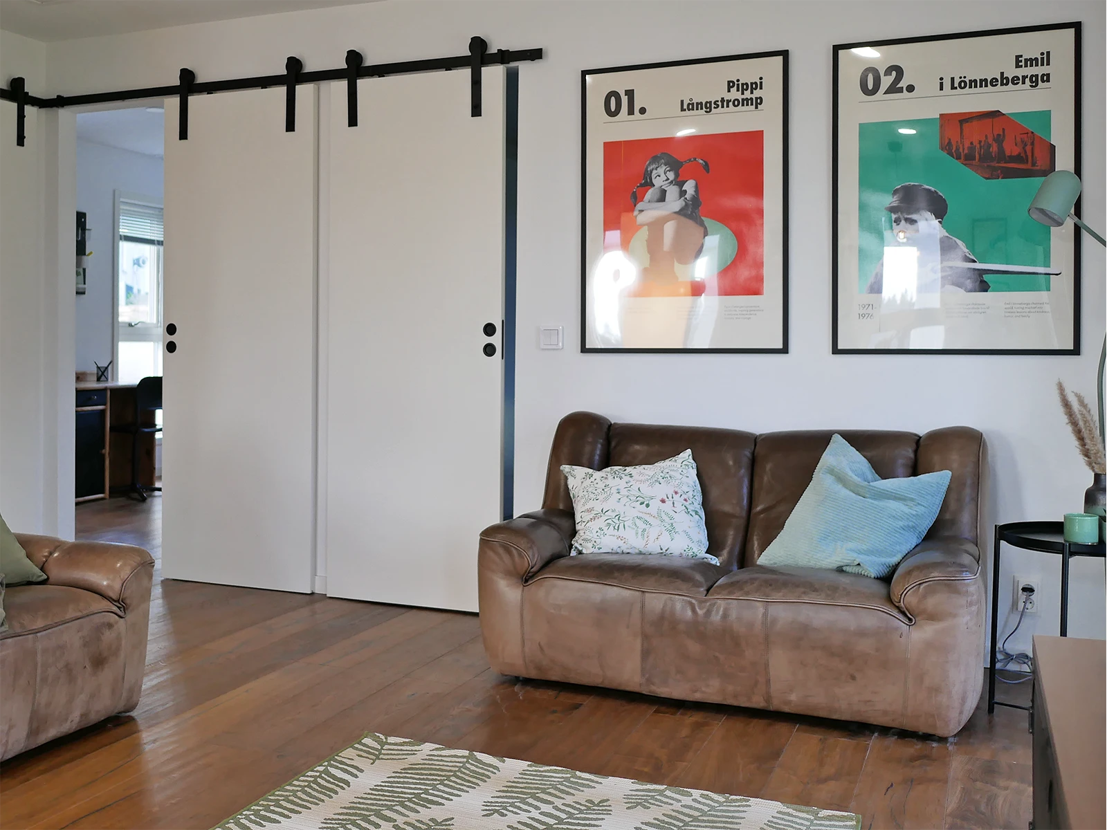
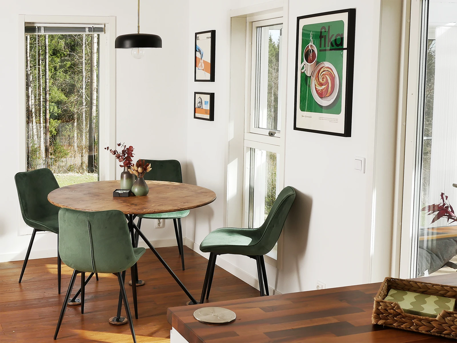
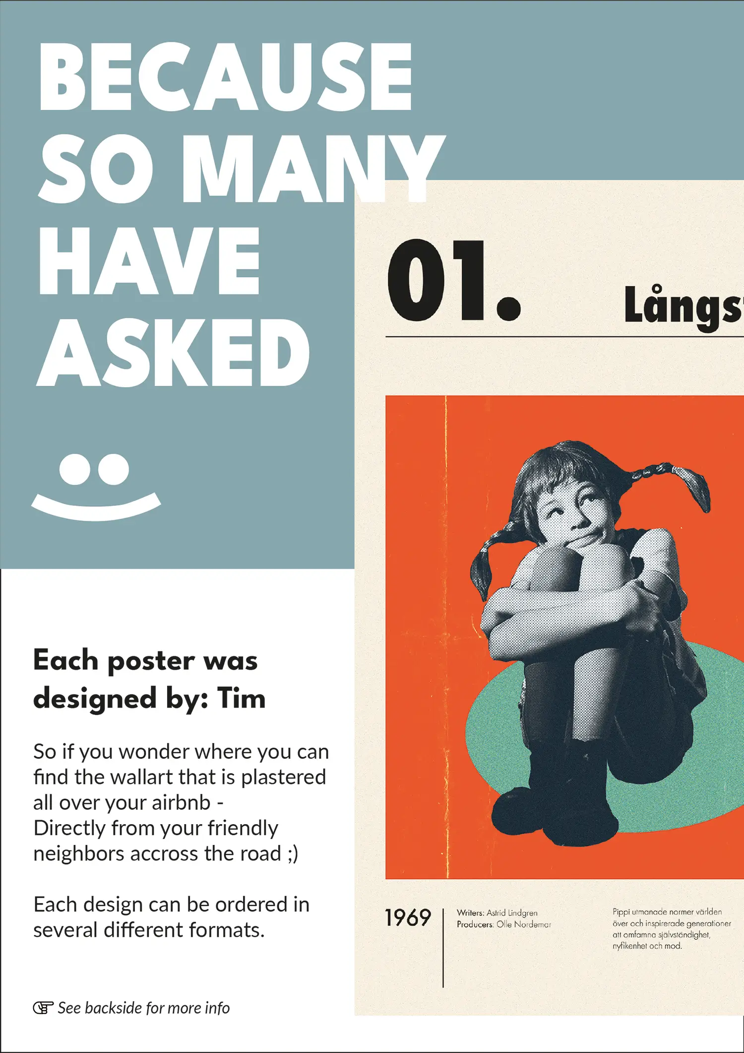
What instantly came to my mind were custom artworks that function as a continuous theme throughout the home, establishing an editorial, magazine-style atmosphere.
By creating different but contonious styles, the prints should never feel overly produced or too staged.
The artwork highlights traditional Swedish customs, breakthrough inventions and iconic personalities, each paired with a brief caption for optional background insight. To reinforce the editorial, magazine-like aesthetic, one series is sequentially numbered, establishing a stringent concept that naturally sparks curiosity to see the rest of the collection. Every piece is strategically placed to match its environment, such as pairing Tetra Pak and Fika in the dining area – creating a thoughtful, cohesive ambiance.
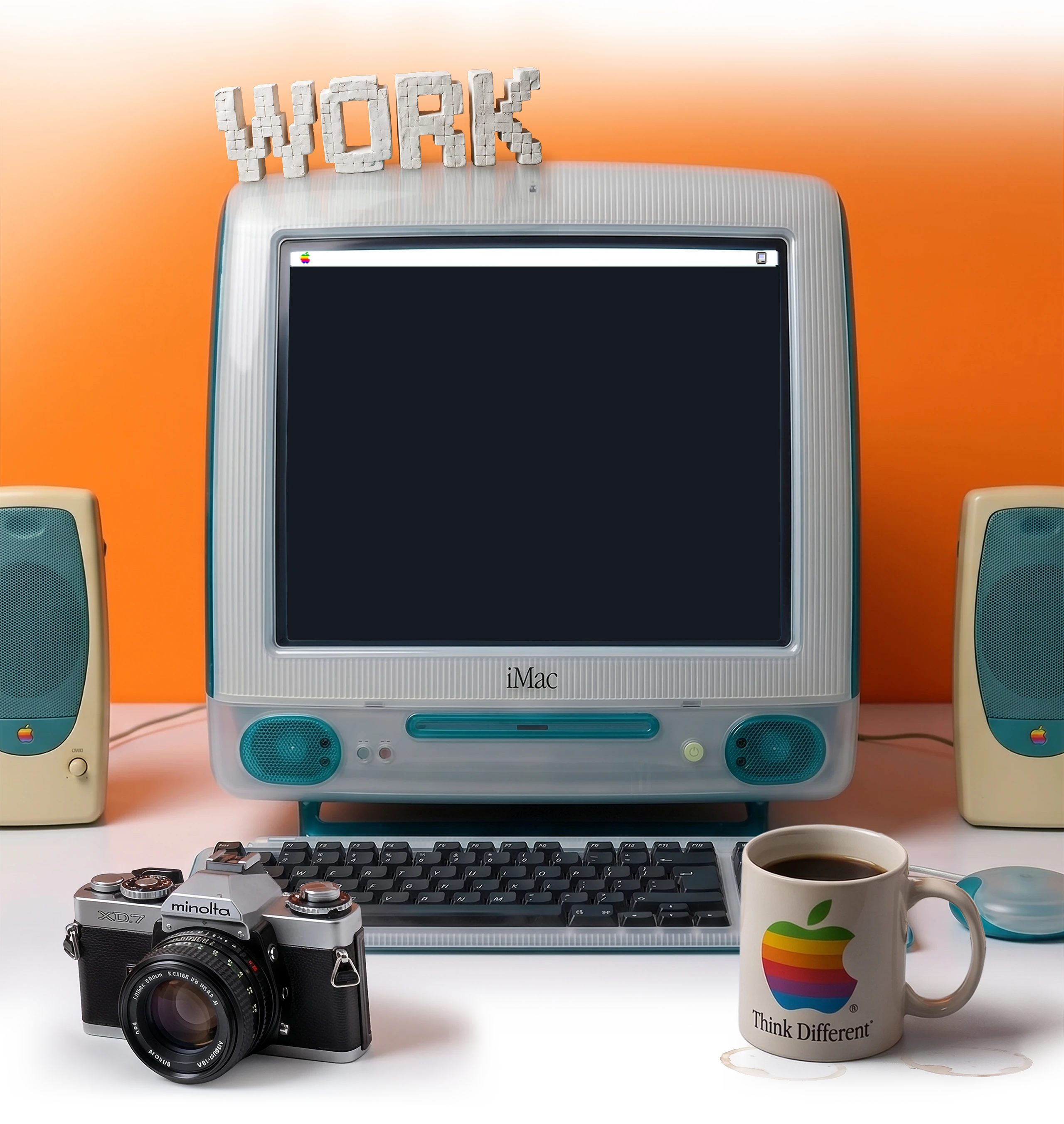
I complemented the primary concept art with these fictional, vintage advertisements that never actually existed.
To create a memorable impression, I gave it a cohesive brand identity with a playful logo, consistent colors, and simple icons.
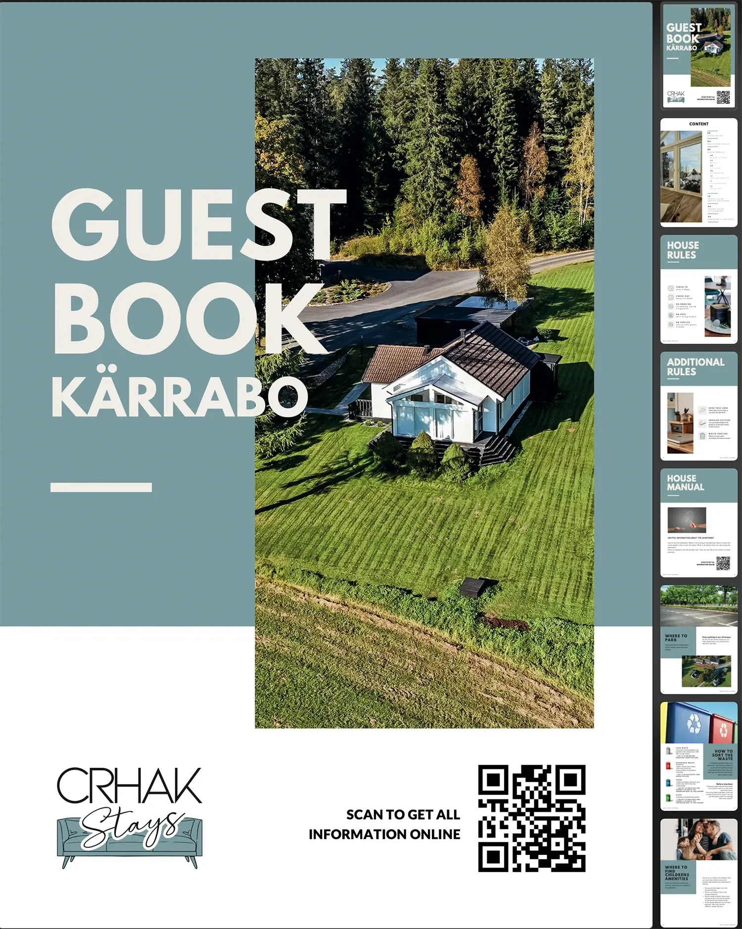
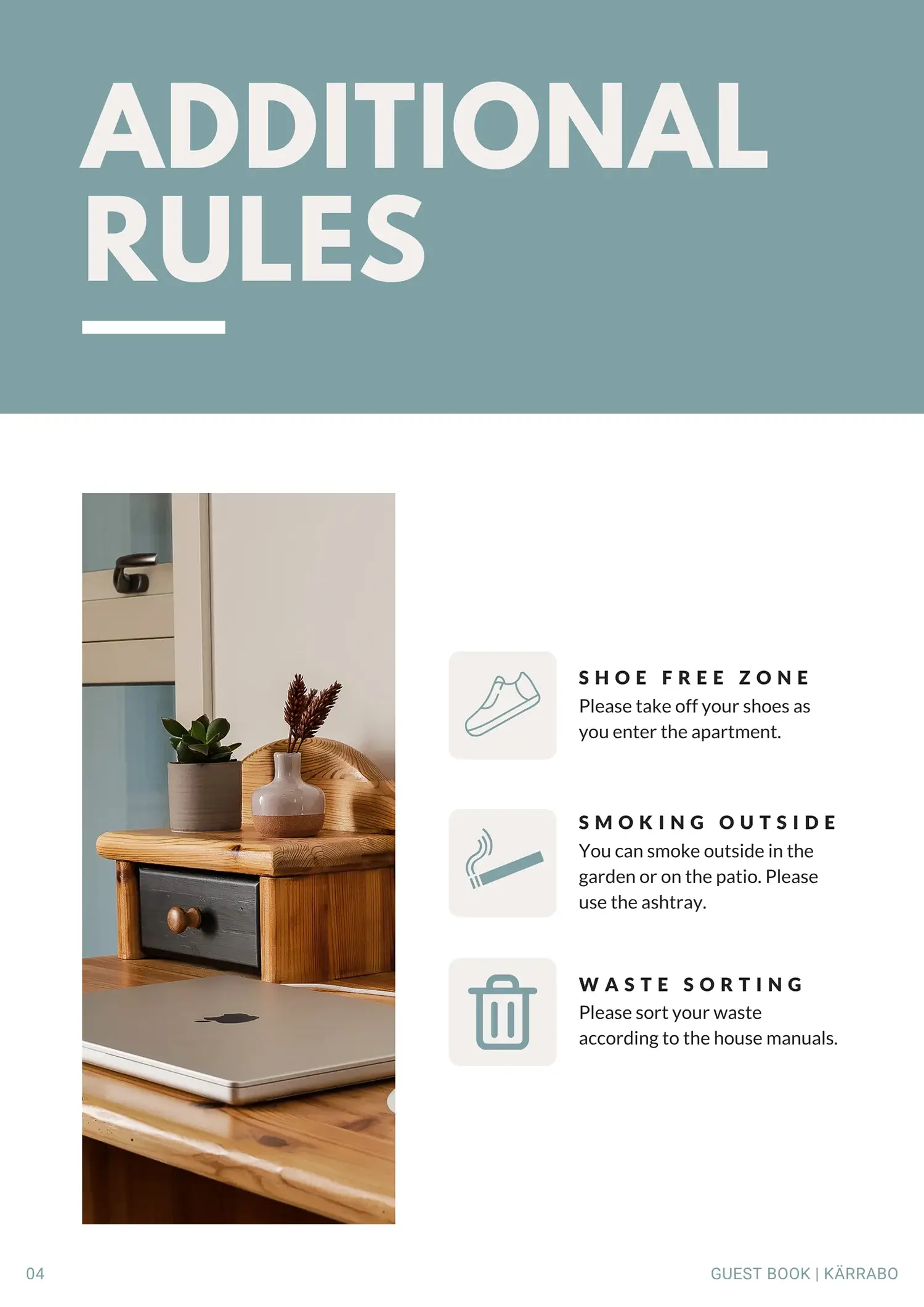
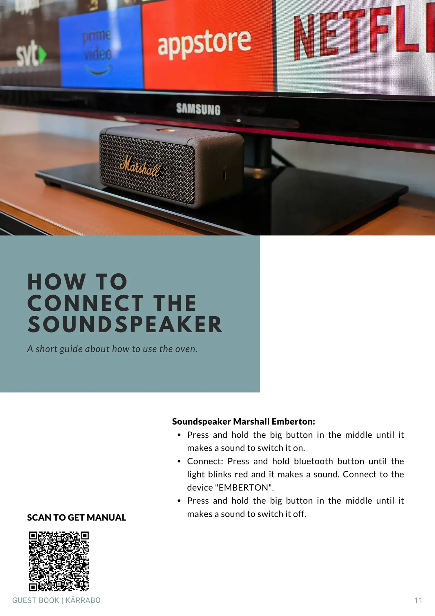
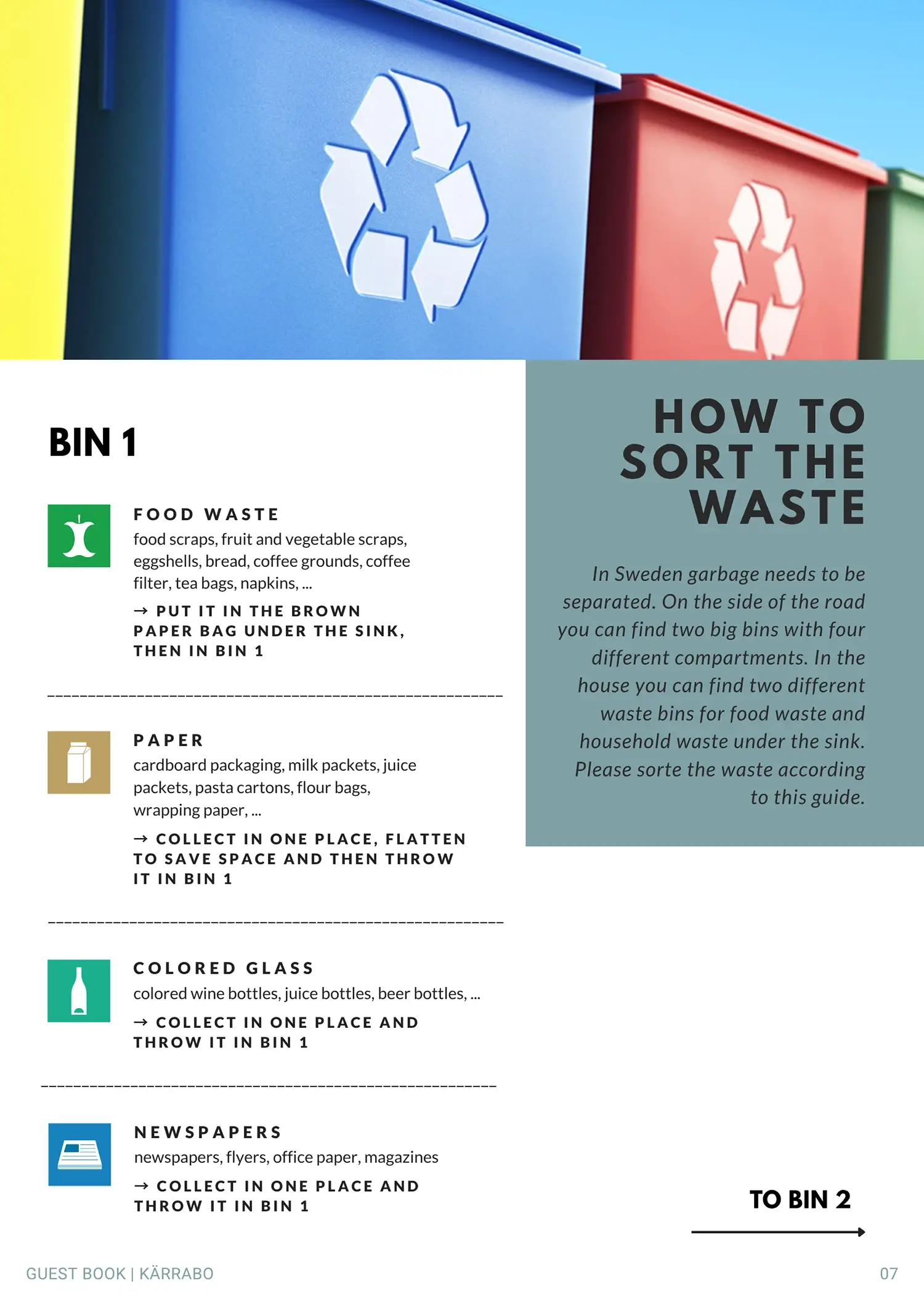
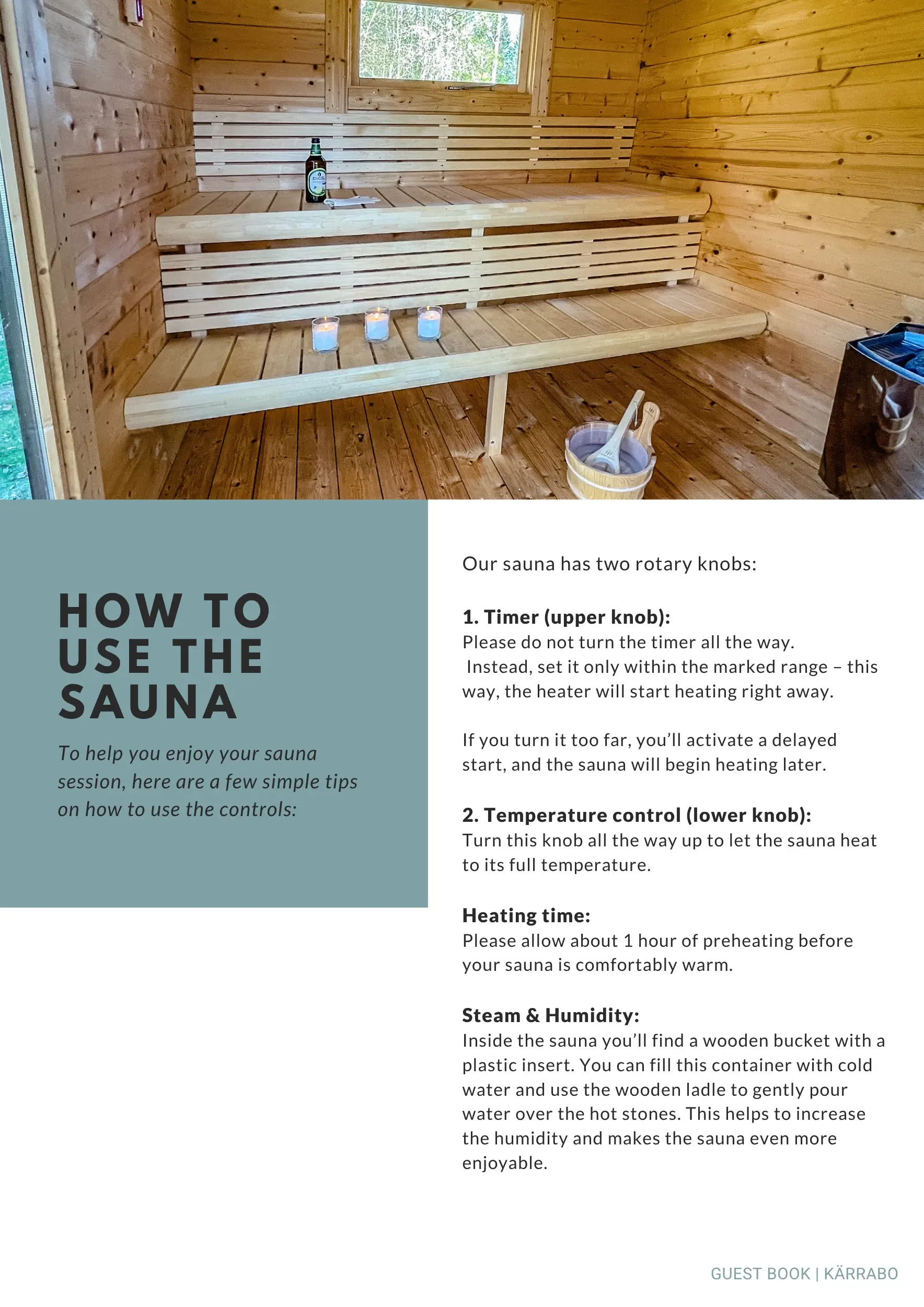
Wishing to create a satisfying experience, we (me and my wife Anja) built a custom guest book as an external website—automatically send upon booking—and a printed version for the guesthouse.
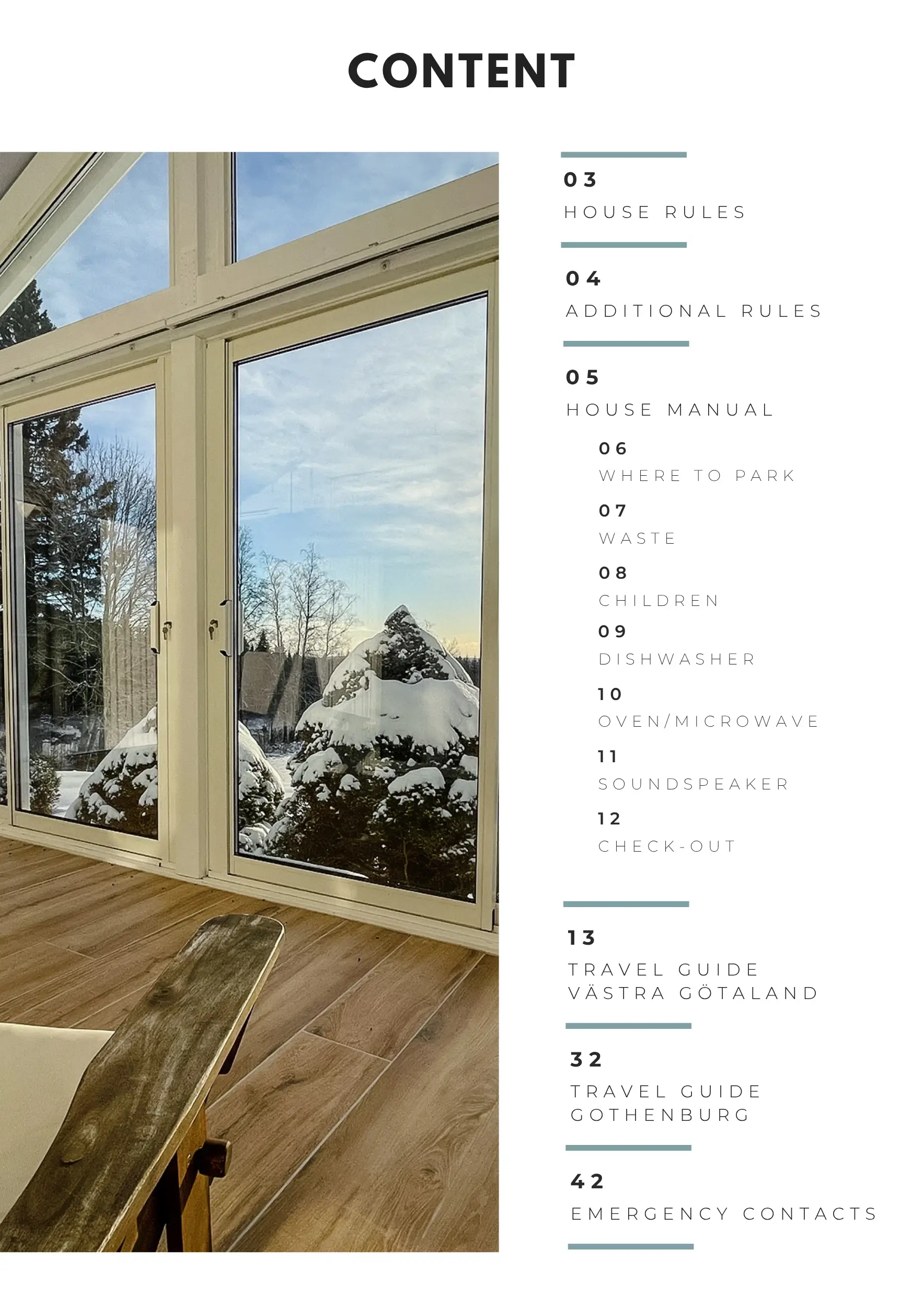
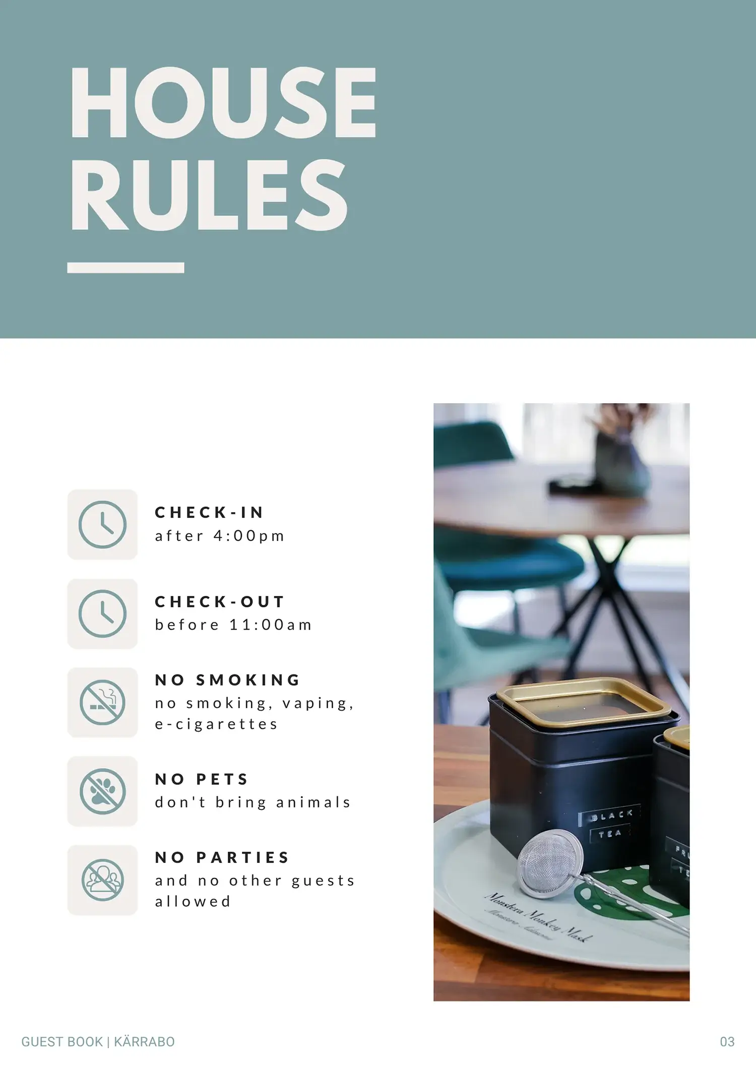
Inside, guests find practical details like house rules, alongside a local activity guide.
Since we launched in May 2025, the guesthouse has been nearly fully booked through every season. Only five-star reviews quickly gave us the „Superhost“ and „Guest Favourite“ status, even earning the property a feature on Airbnb’s landing page for regional Sweden searches.
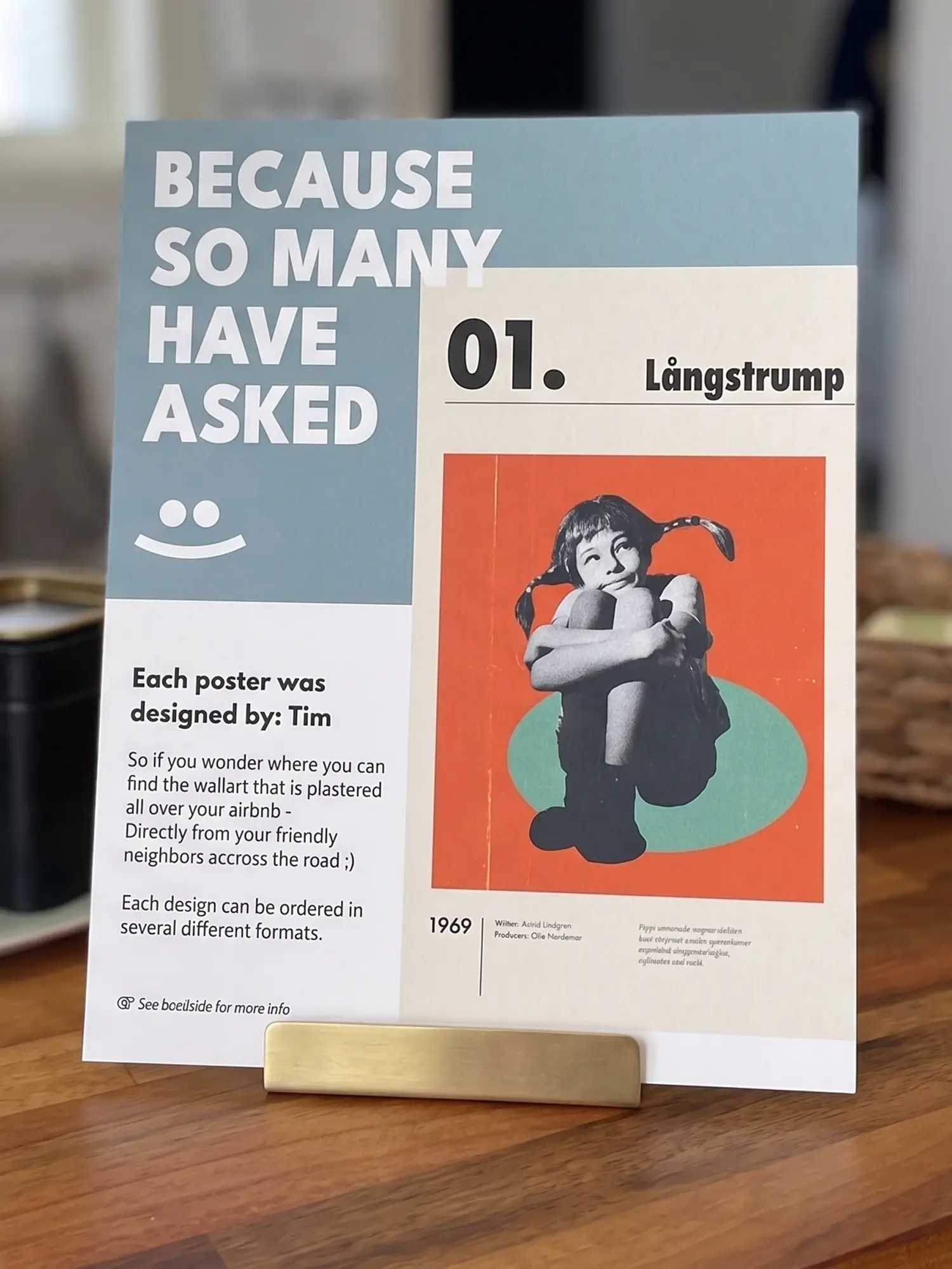
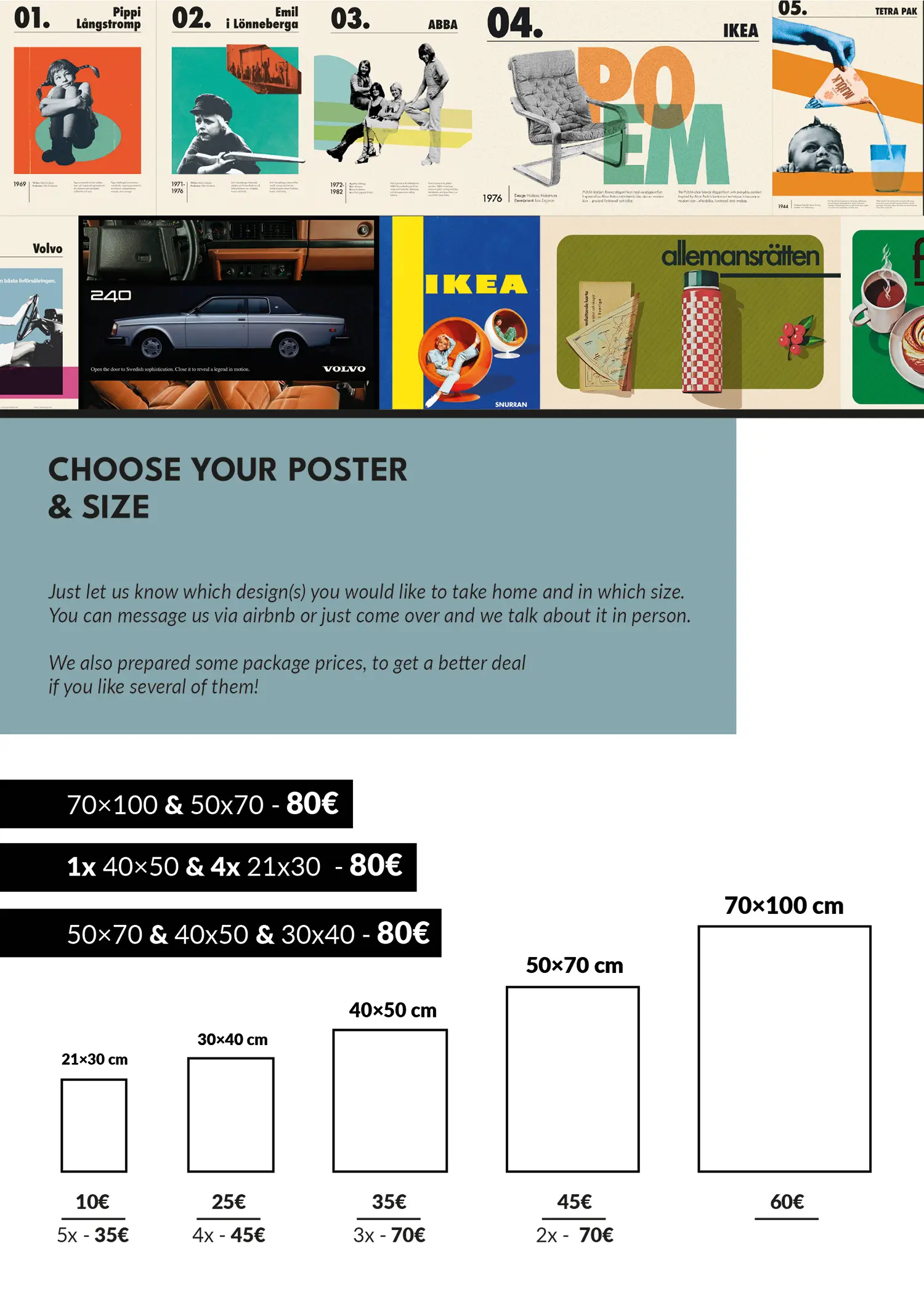
What I didn’t expect was the actual interest in the custom artworks.
Multiple guests proactively asked where they could buy the prints.
This led me to create an „in-house flyer“ displaying available sizes and pricing, making sure that anyone who wants to take home a unique Swedish souvenir knows that they can purchase it from us :)