Bauchgefühl Rezepte

2020/01
bauchgefuehl-rezepte-food-blog-header

The brief

It was 2020 and corona had just arrived.
My then girlfriend and now wife was sitting at home because she was a math teacher and in Germany all the schools were closed. As her biggest passion is cooking and she is really good at it, she decided to start a food blog. After a short period of time she had built a proper WordPress blog. Now she just needed some branding and visual guidance to go along with her neatly prepared and SEO optimized page.

The blog should not be too playful or flashy, to underline her seriousness in cooking—or better said, to go along with her advanced cuisine. The same with the logo for the blog: it should directly state that this is about food and cooking, without screaming what it is. Subtle.

The identity

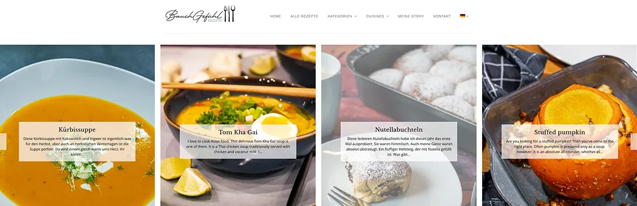
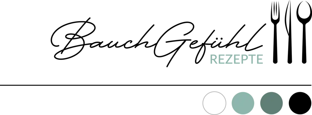
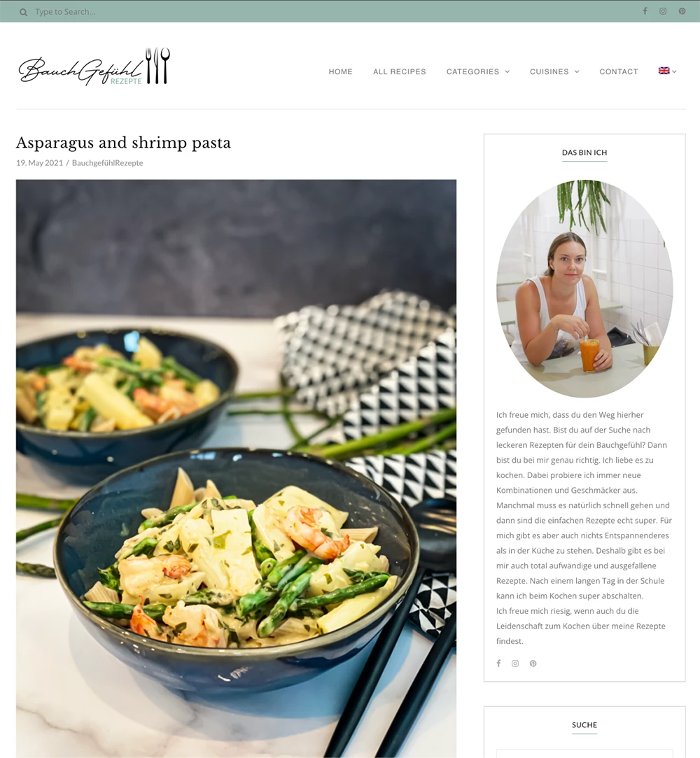
The tones of the website are mostly white with a mellow turquoise and a secondary, darker turquoise accent. All text is written in a dark grey, not 100% black, so it’s not too hard on the eyes. All styling elements (like mood pictures) are framed in circles, and other than that, there are only fine lines as further elements in the same grey as the text.

The name of the blog is “Bauchgefühl Rezepte”, which means “cooking from your gut feeling”—no fixed recipes, you just do whatever you like. This name is meant to show that cooking is fun and you don’t have to follow strict rules.
Therefore, the font chosen for the “Bauchgefühl” part is a playful one, while “Rezepte” (recipes) is set in a classic sans-serif font using the same turquoise that serves as the blog’s signature color.

The logo incorporates all the essential cutlery—fork, knife, and spoon in a heavily stylized but clearly recognizable way that captures just the essence of the silhouettes in solid black.
The idea

The blog is clear and well-structured, allowing you to either browse around or select your recipes by categories or cuisines. Available in German and English.

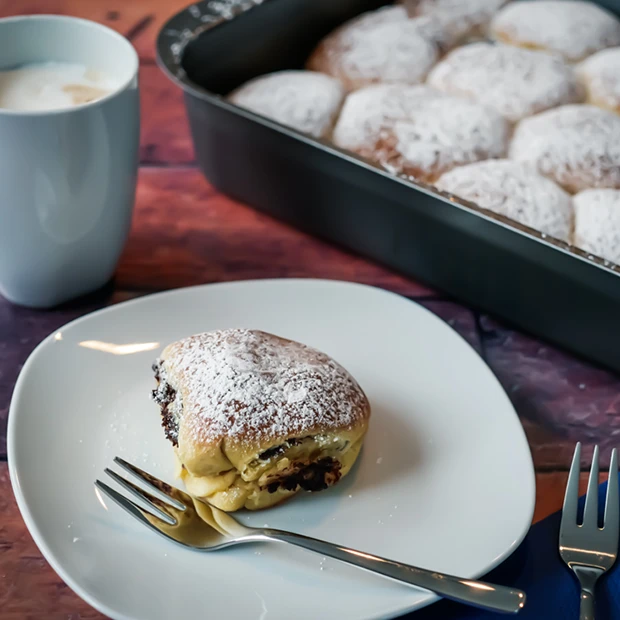
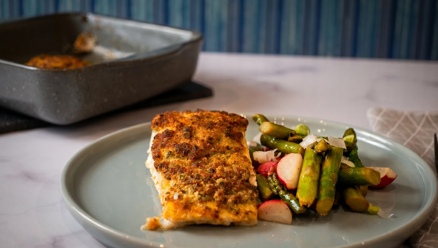
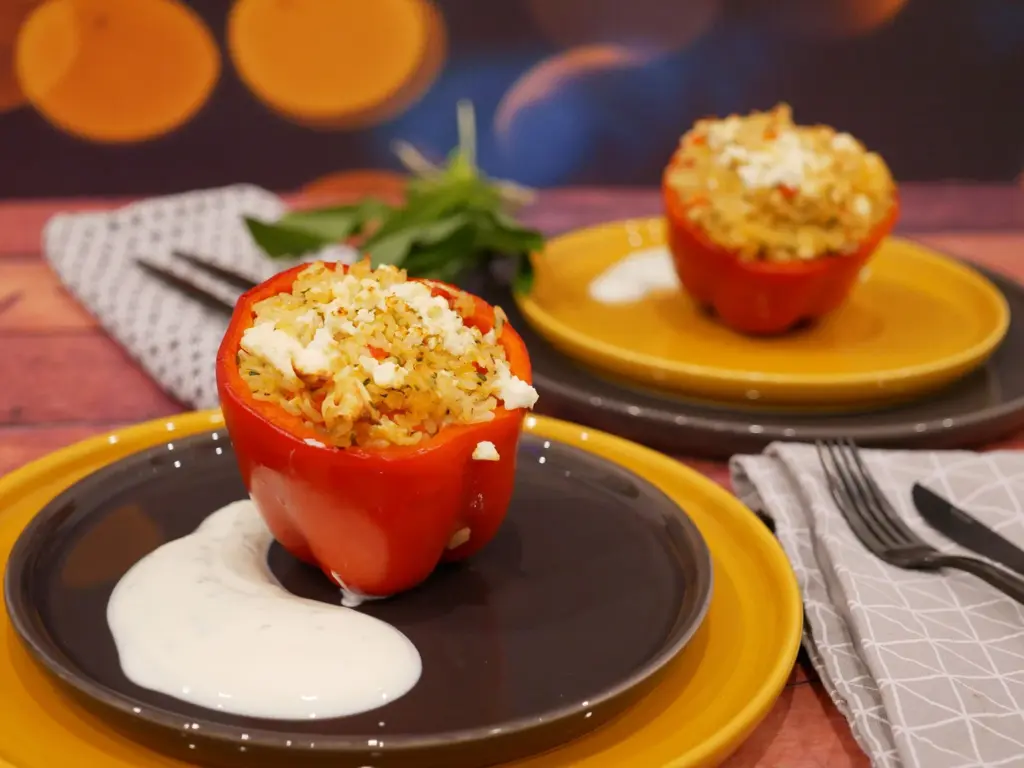
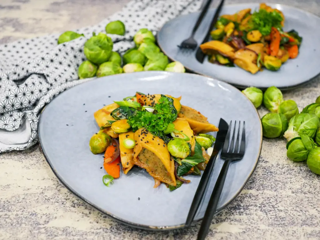
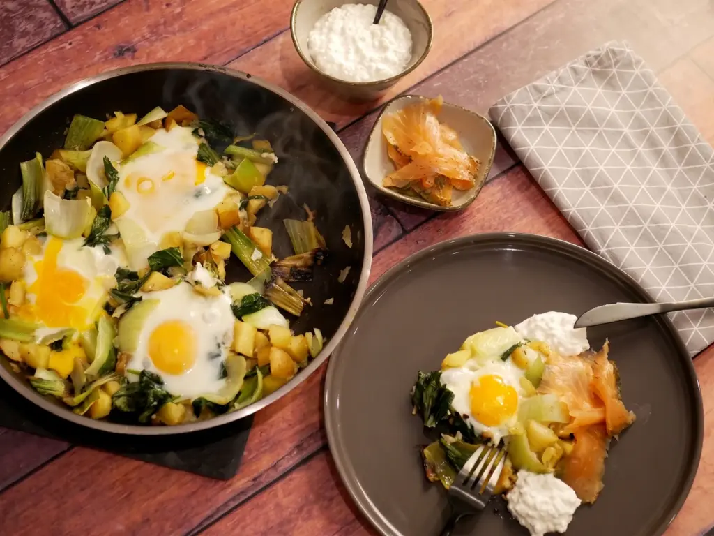
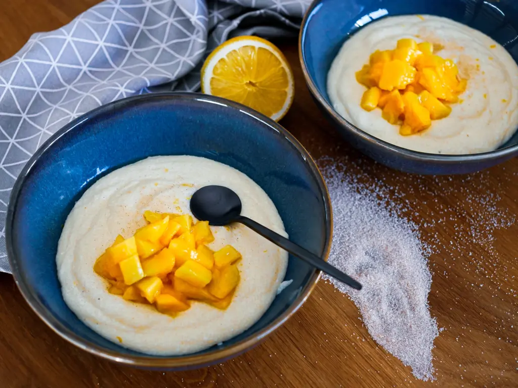
All the pictures feature matching bowls, plates, and cutlery that resemble the Bauchgefühl Rezepte logo.

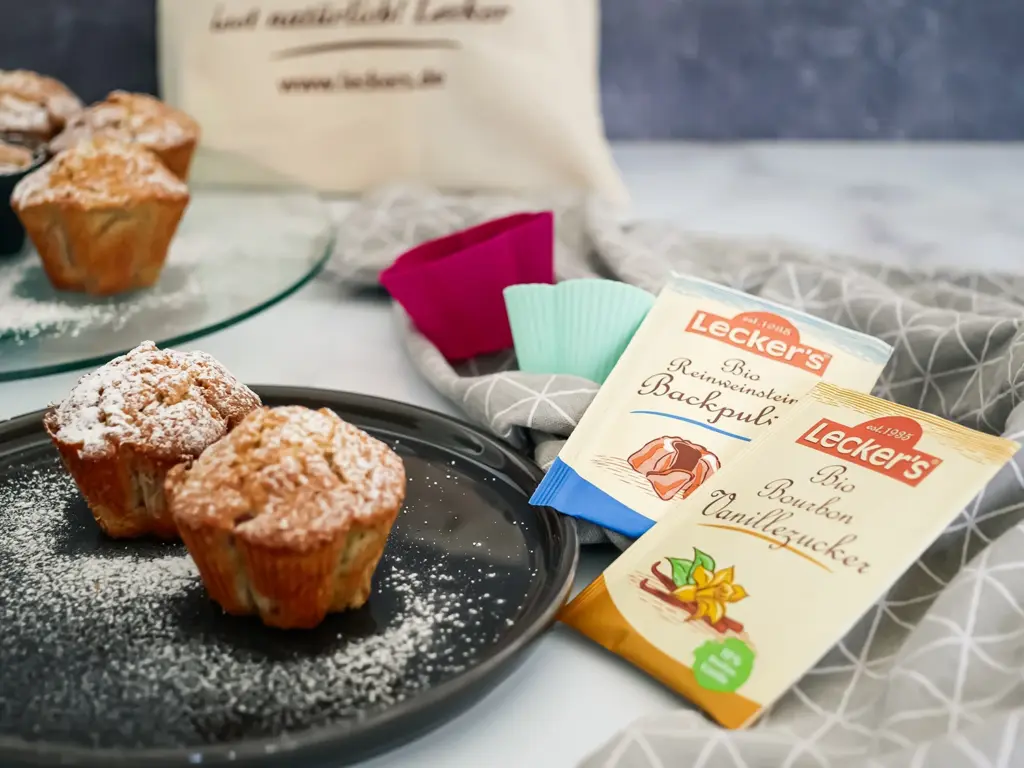
The visual language relies on professionally lit and carefully aranged food photography where the textures of the dishes take center stage against a (artificially printed) naturally seeming background.

The color palette is intentionally restrained and subtle, completely avoiding flashy or overly playful hues to ground the blog in a serious, sophisticated aesthetic.

The trick with the prints

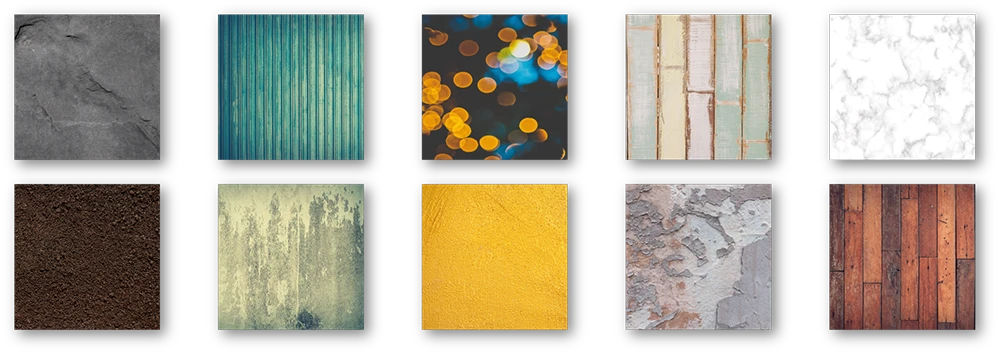
To avoid using the same background over and over, I created 10 square background plates (60x60cm) from 4mm MDF covered with realistic natural prints. This allows the ground and background to be interchanged so the blog photos never look the same. Combining these 10 pieces in pairs provides 90 unique setups (45 unique pairs that can each be swapped between the ground and background).

Setting the tone

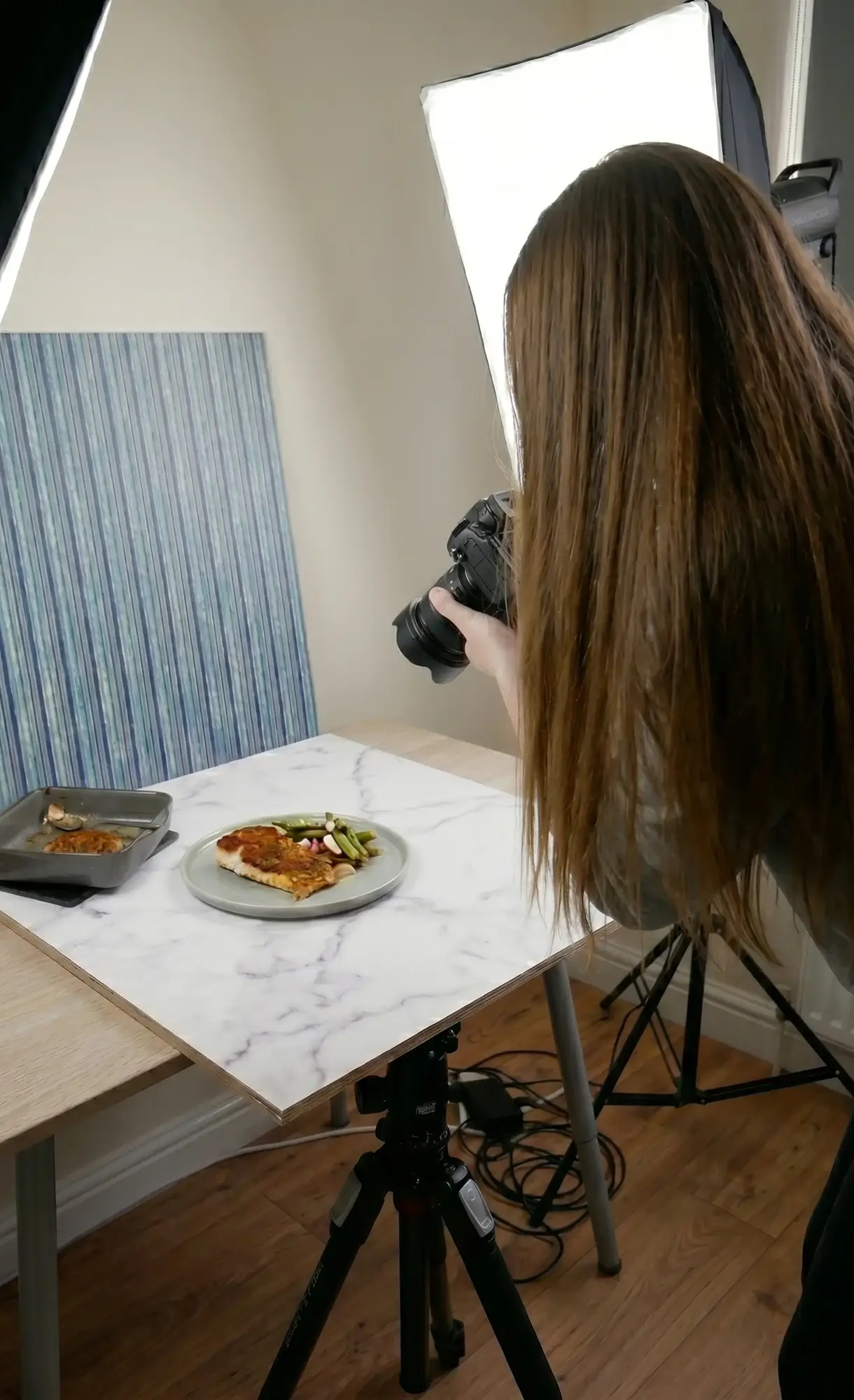
I then set up some guidelines for Anja on how to take the photos, which perspectives to use, and how to arrange the elements to ensure an attractive-looking picture in the end. I took all the photos into Photoshop to refine the colors and details. Since there was no AI at the time, every picture is 100% „handmade“ :)

With these guidelines and a little bit of trial and error, Anja was able to produce high-quality pictures in her home studio, keeping the look fresh by using the diverse backgrounds.