Clockwork Outerwear

2014/03
header-clockwork-outerwear

The concept

In 2014, Clockwork Outerwear was a functional clothing startup, trying to conquer the German bicycle market, which was heavily growing at that time. The idea was to start with downhill / all-mountain gear and later evolve to an all-around outdoor clothing brand.

As the budget was relatively small, the goal was to create a clothing line that made a professional impression, not noticeably different from large, established brands, while style variations had to be kept to a minimum due to keeping production costs manageable.

The founders had no touchpoints with graphic design, so I was tasked with the art direction of the holistic brand identity & product development until the products were market-ready.
The brand identity

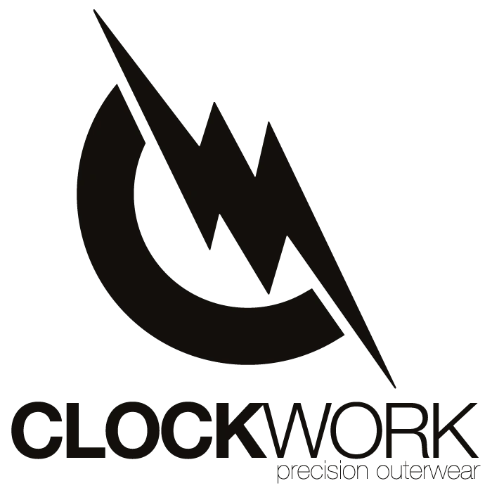
As the brand originated in the cycling space, which involves the movement of the pedals and being competitive, training, and just functioning to get to your goal, the name “CLOCKWORK” was chosen, bringing these two aspects together in one well-known phrase (“going like clockwork”). The minimal, elegant font style and the addition of the claim “precision outerwear” are meant to underline the quality aspect and direction the brand is aiming for.

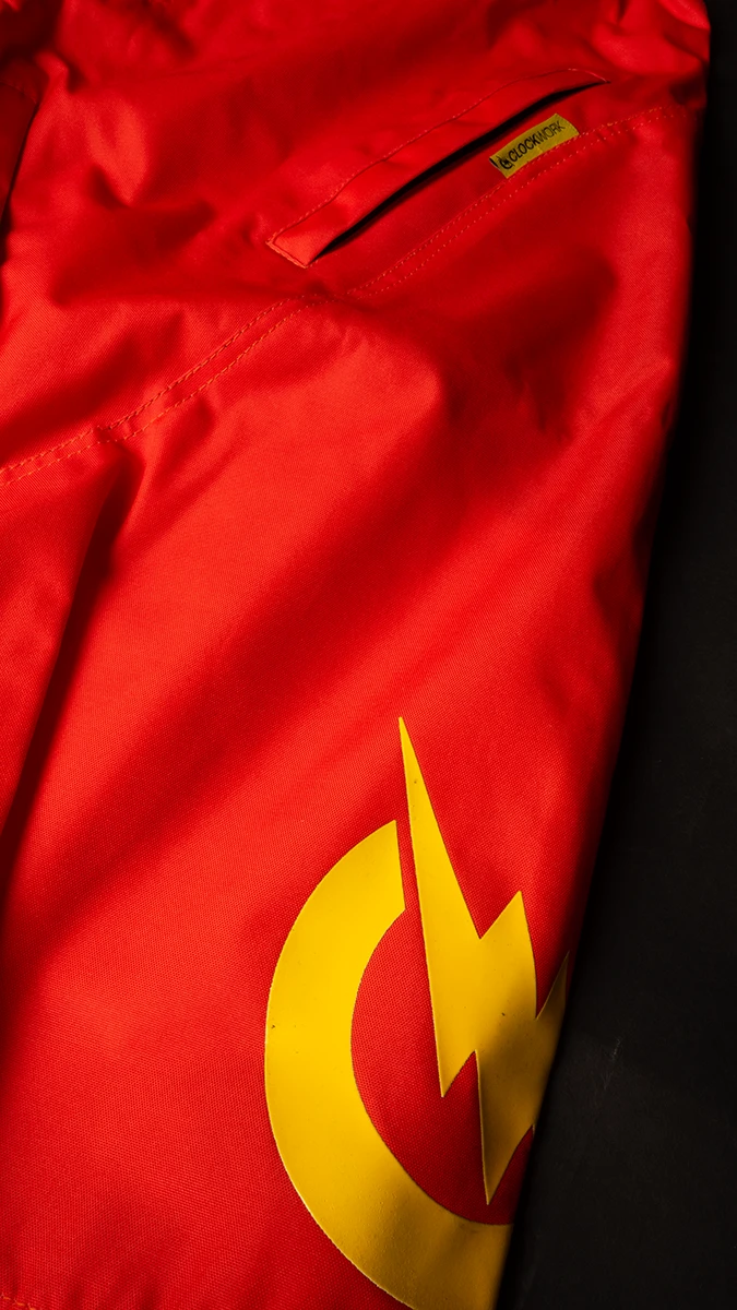
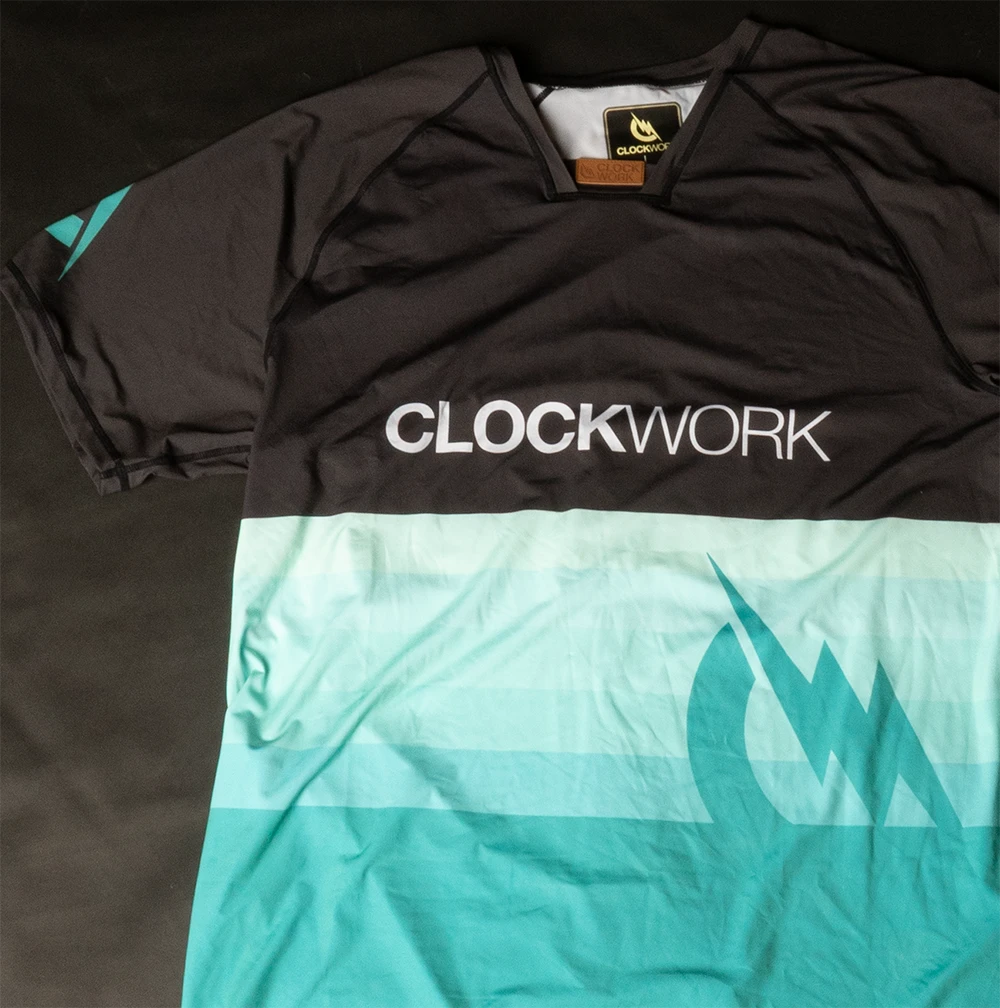
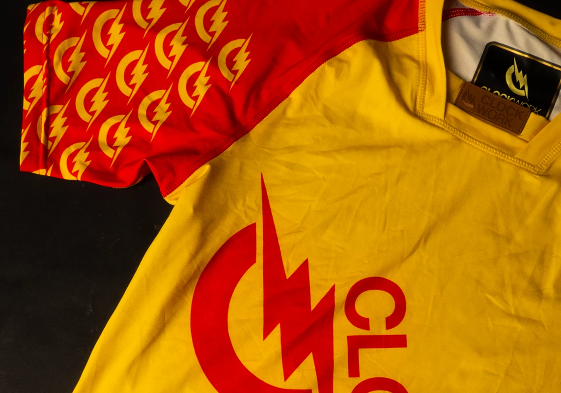
As the identity should be rooted in the outdoor segment, for the logo itself a simplified version of a curved road and a forest line were combined, pointing to the cycling and outdoor aspects and at the same time resembling the initials C & W of the brand name CLOCKWORK.

The execution

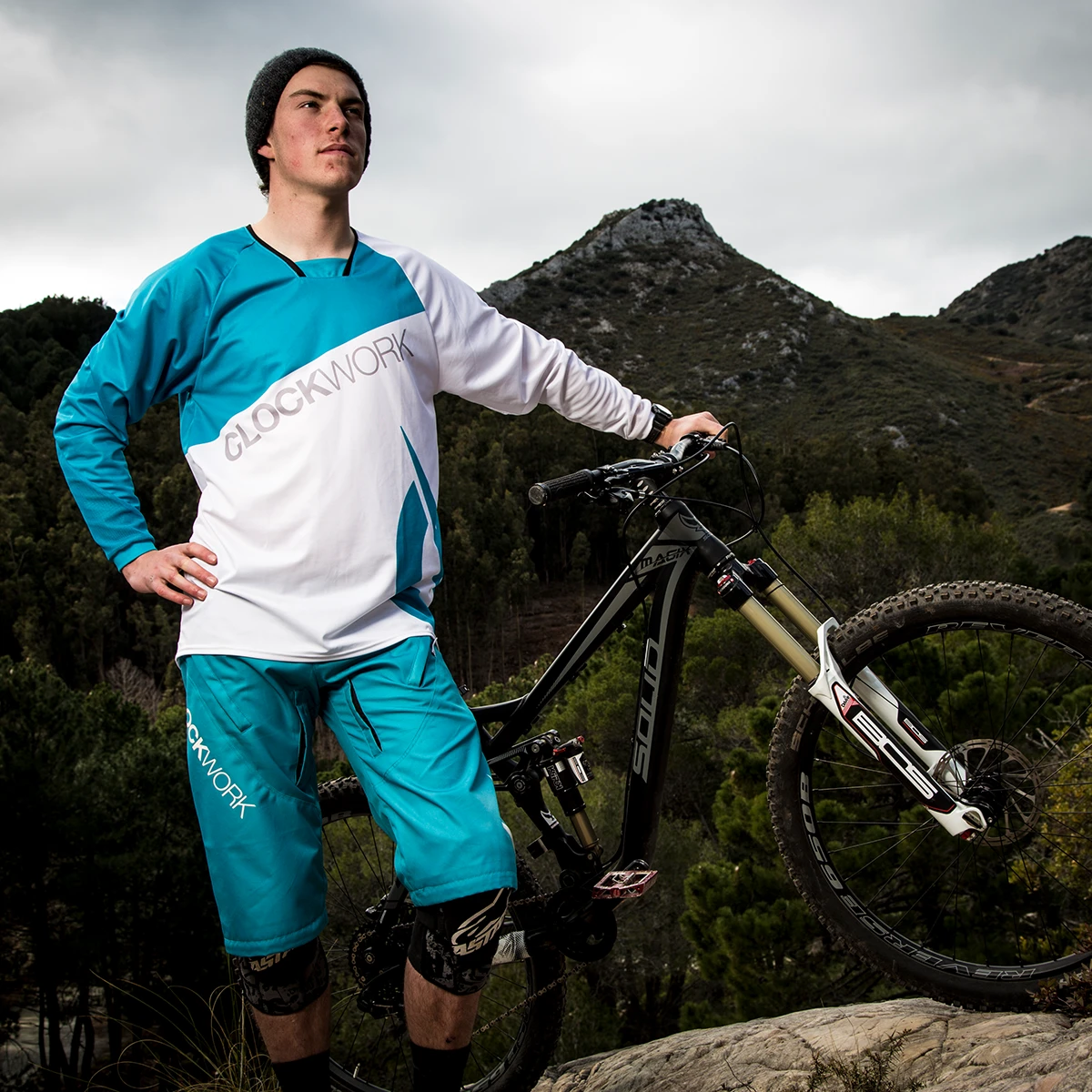
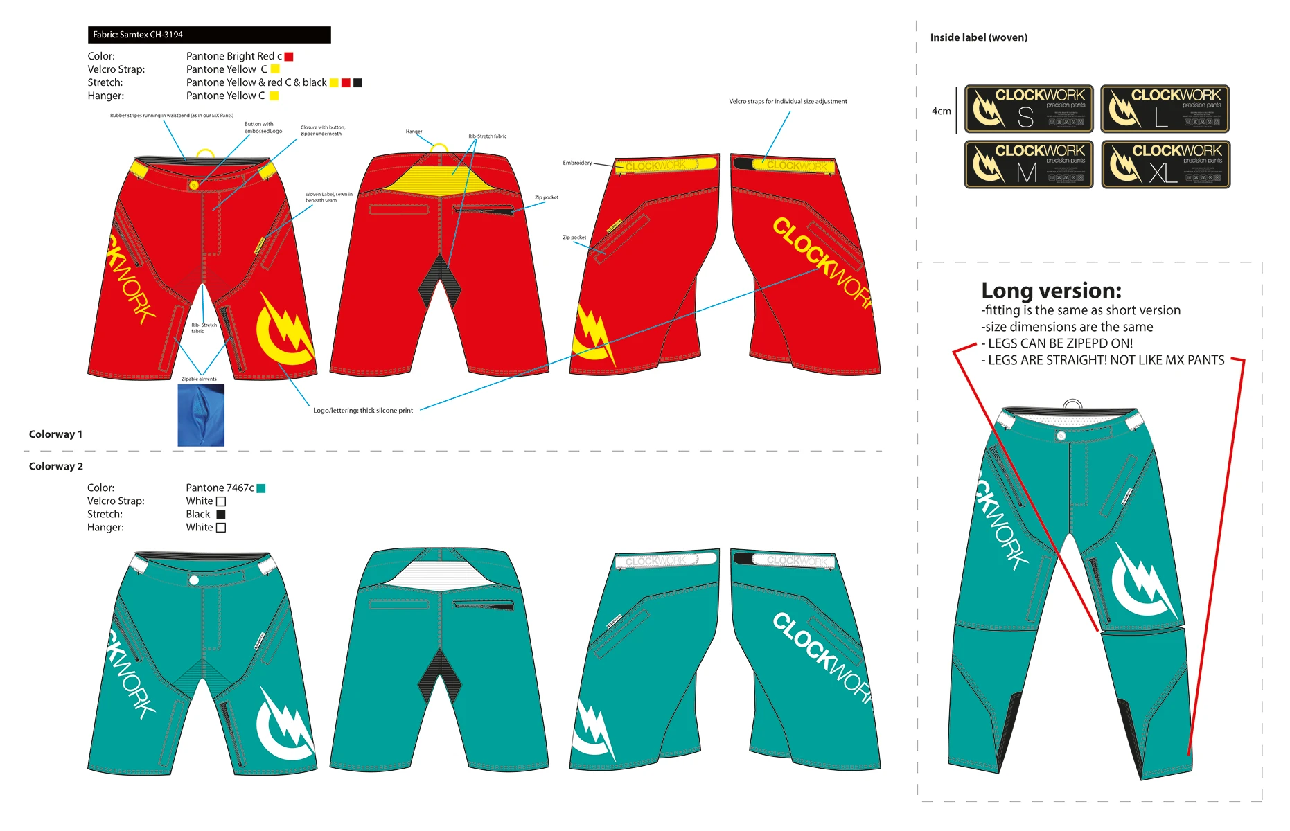
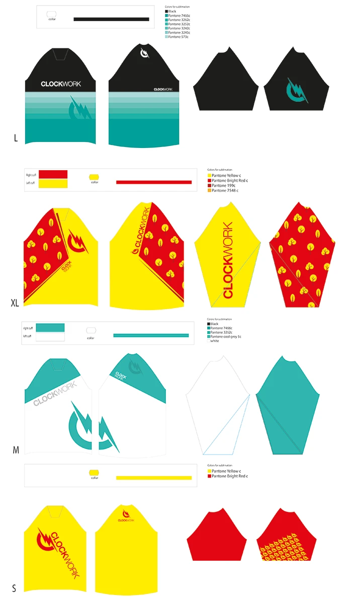
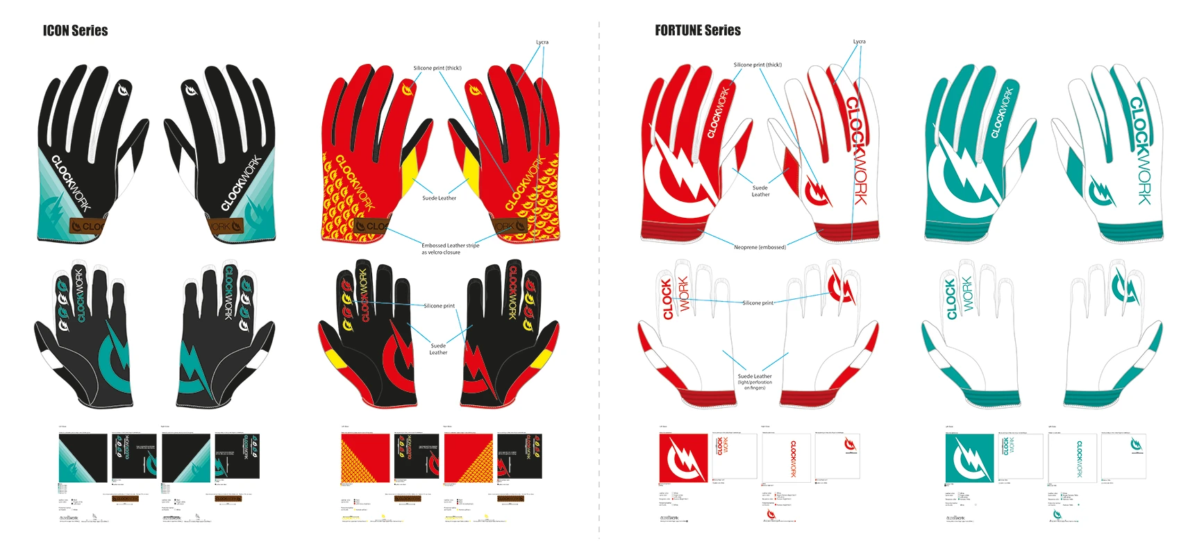
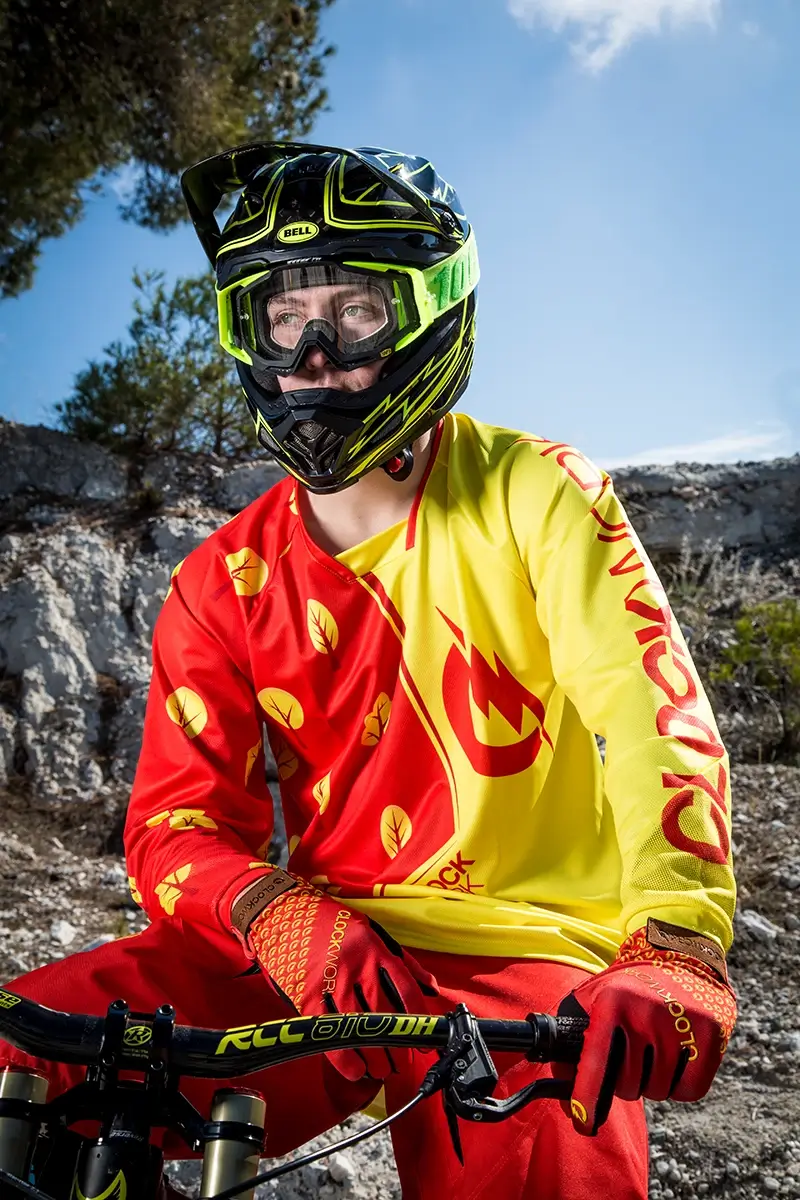
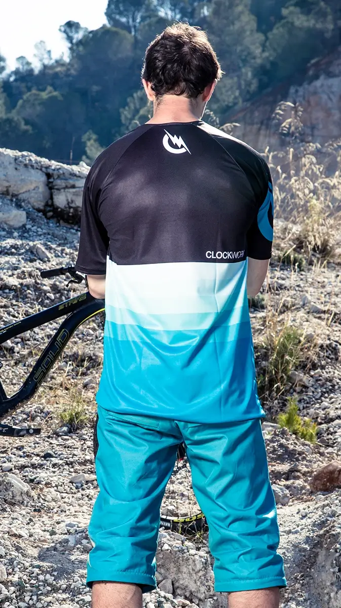
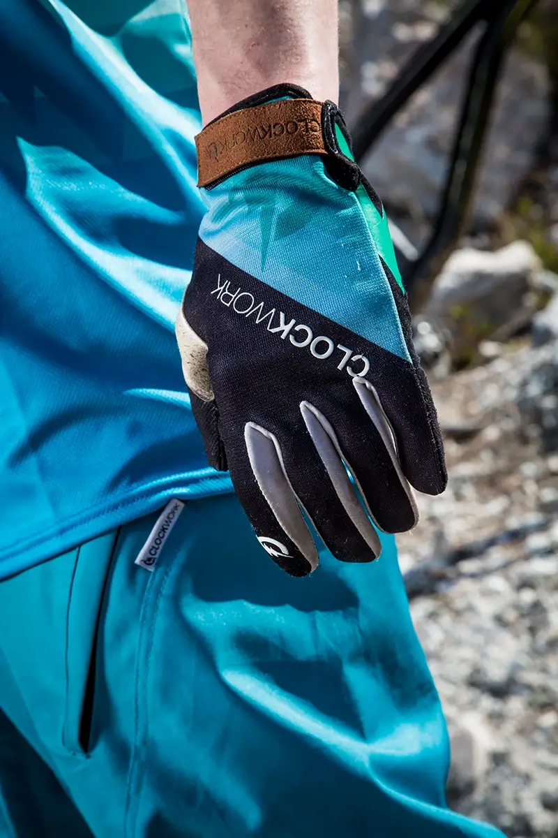
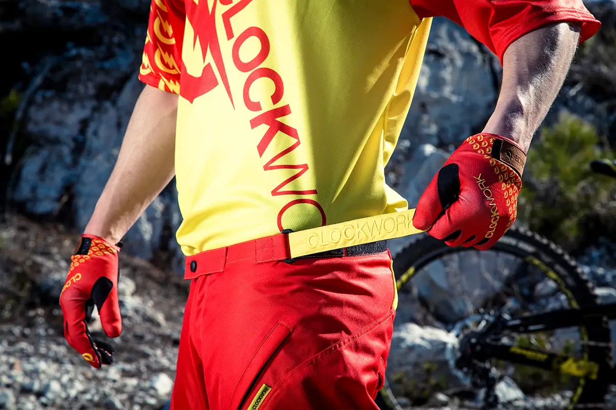
I developed a concept for two different lines of bicycle clothing, but always keeping two colour schemes, so all the items are interchangeable, giving the whole collection more variety for the customer. The pants would only differ in colour and were available in a short and (zippable) long version—based on the short pants, allowing this variation to be produced without new development costs.

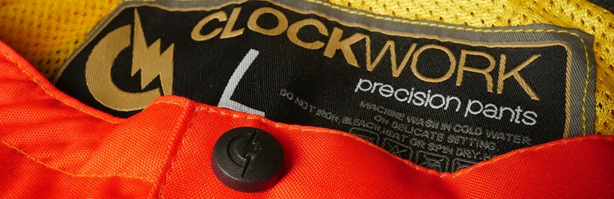
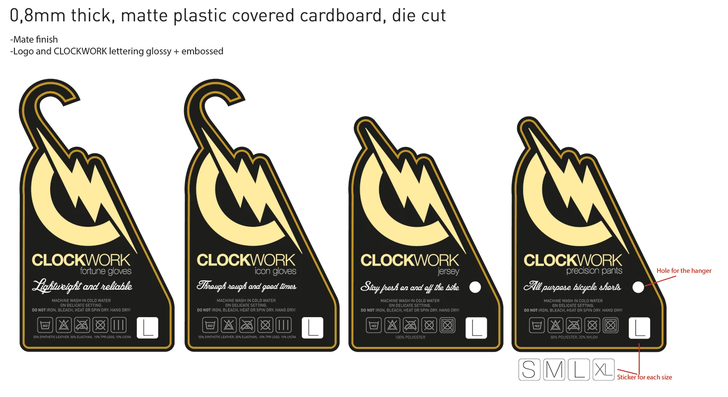
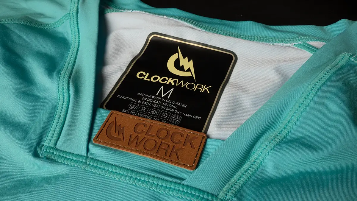
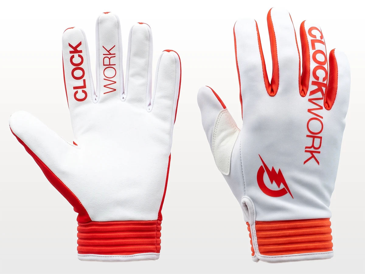
With the limited budget in mind, all the product branding, like silicone prints, branded buttons, embroidery—everything that required tooling costs—was kept the same within the colour variations; with only the colour of the application itself changing, incurring no additional setup expenses. Everything that was sublimated was designed differently on each item, to show variety in the designs. From a selection of fabrics and materials and after several sample runs, I decided on the final materials and manufacturing techniques.

The end

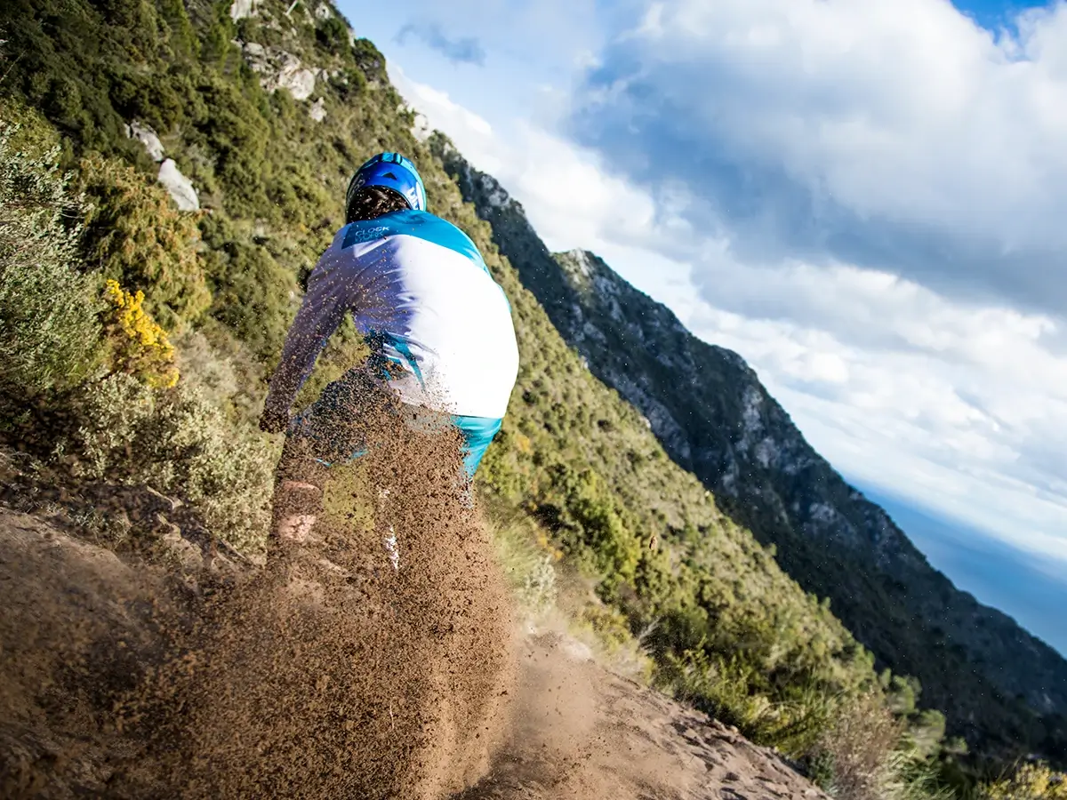
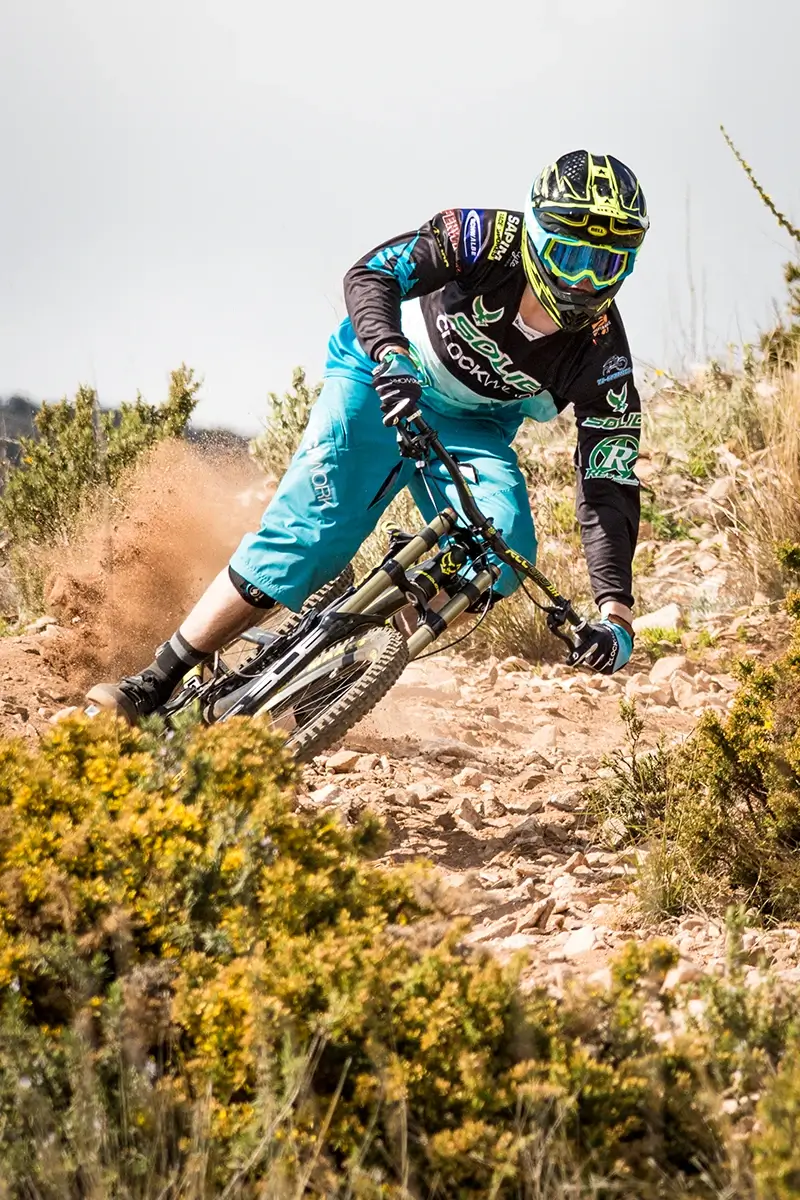
It was a promising start for the brand; contracts with one of the larger German teams (Solid Bikes), which was racing the UCI World Cup, were made, giving the clothing some serious media coverage. Dealer contracts with several resellers were signed, and the first production of around 10,000 items was almost completely pre-financed. Due to problems with one of the manufacturers delaying the delivery of the pants for several months, the usual release date for the start of the season was missed and the contracts were canceled. Beginning of2015 was the end for CLOCKWORK before it even started, leaving the founders with a massive volume of stock that were nearly impossible to sell mid-season and without reseller contracts.