Bauchgefühl Rezepte – food blog
the brief
It was 2020 and corona had just arrived.
My then girlfriend and now wife was sitting at home because she was a math teacher and in Germany all the schools were closed. As her biggest passion is cooking and she is really good at it, she decided to start a food blog.
After a short period of time she had built a proper WordPress blog. Now she just needed some branding and visual guidance to go along with her neatly prepared and SEO optimized page.
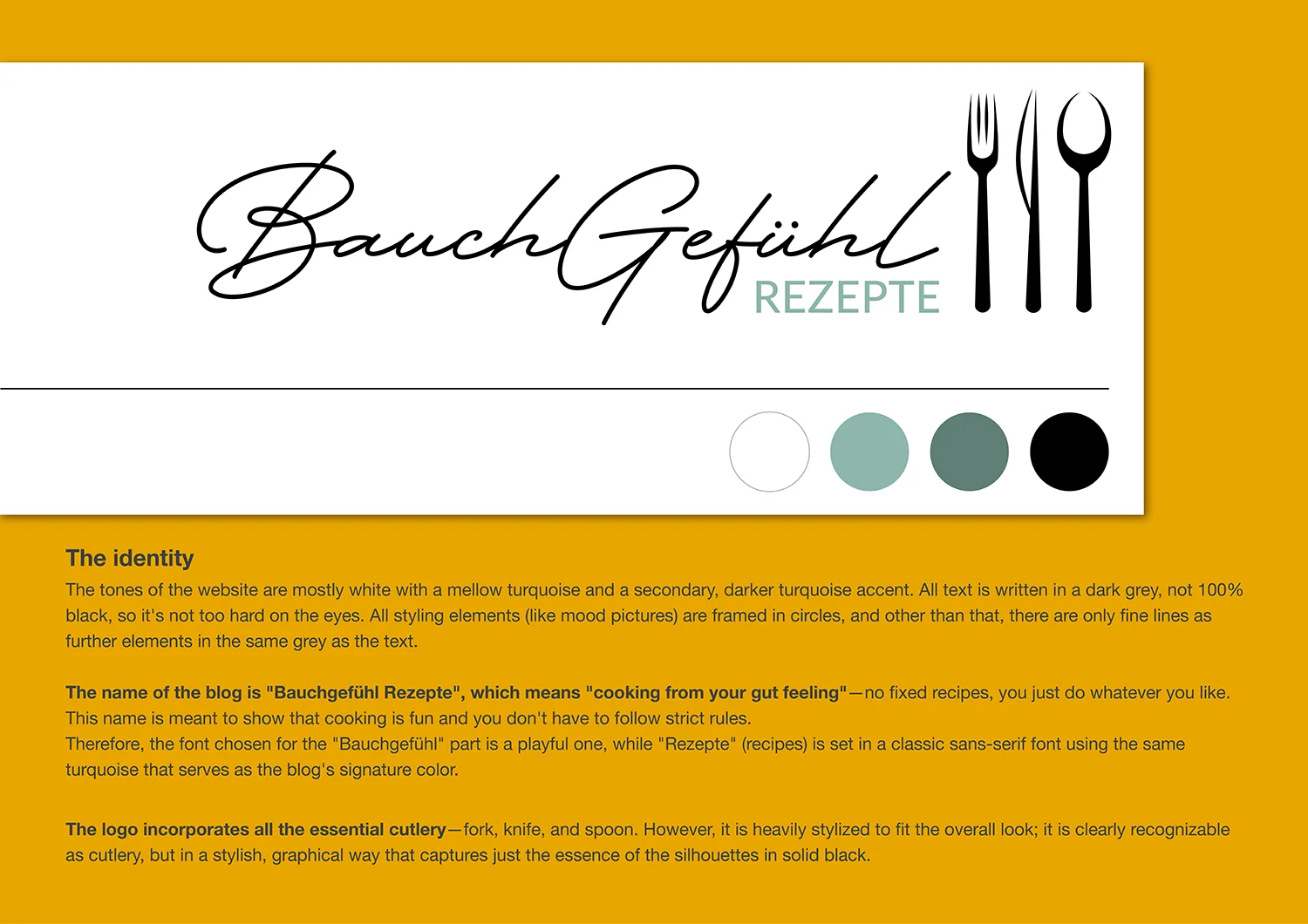
The blog should not be too playful or flashy, to underline her seriousness in cooking—or better said, to go along with her advanced cuisine. The same with the logo for the blog: it should directly state that this is about food and cooking, without screaming what it is. Subtle.
the solution
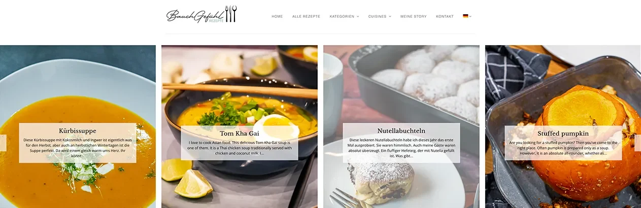
The “advanced cuisine” is transported through a deliberate choice of clean, minimalist design elements that keep the focus entirely on culinary craftsmanship.
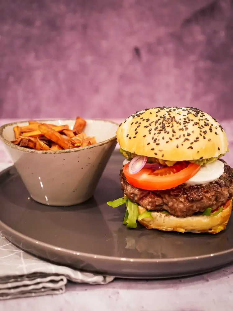
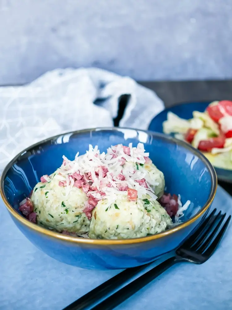
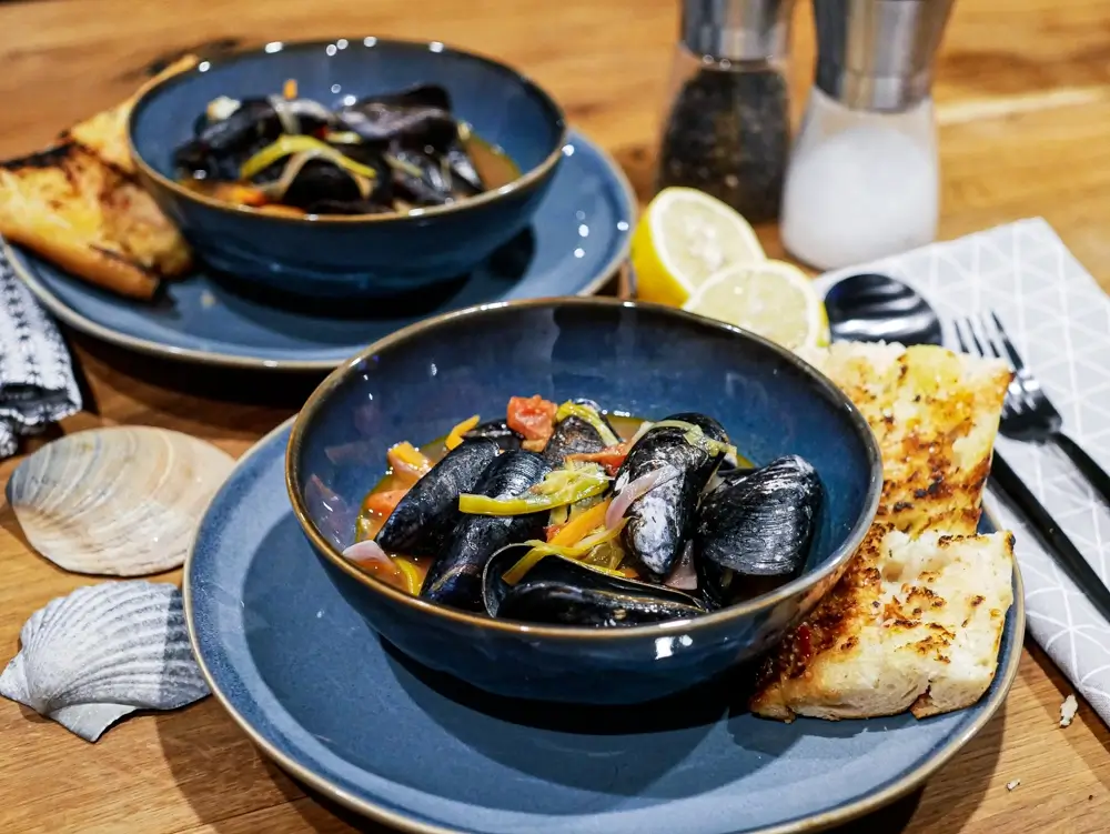
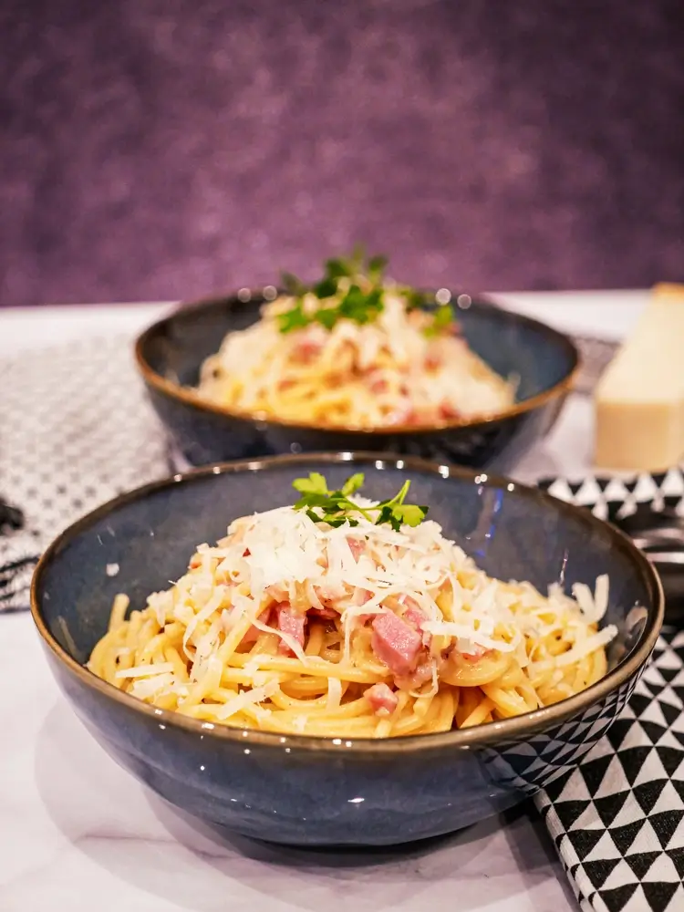
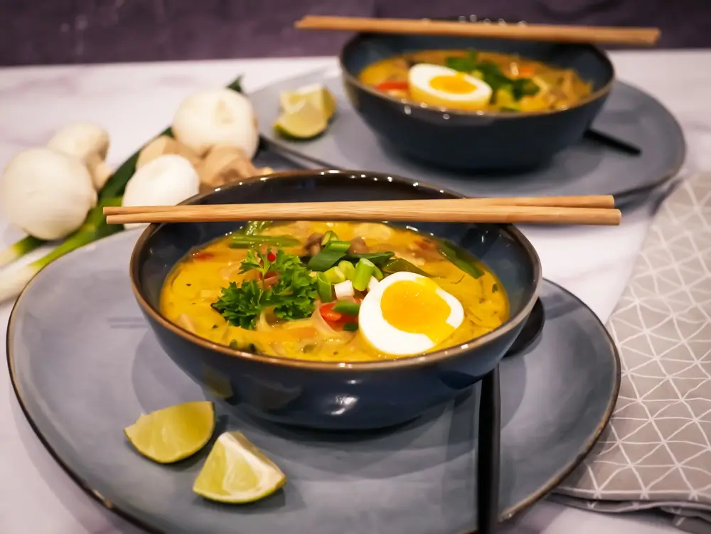
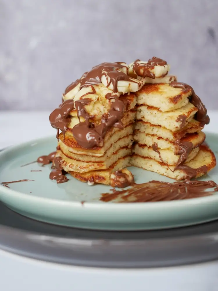
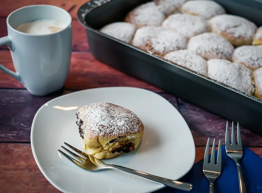
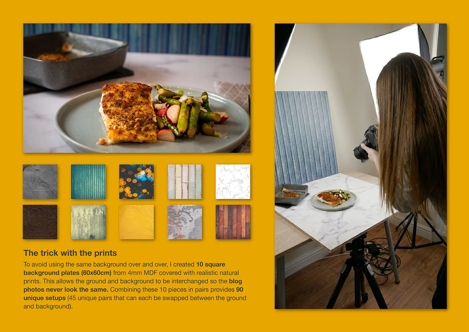
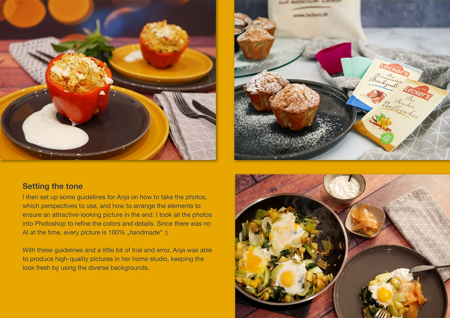
The visual language relies on professional, beautifully lit, and carefully arranged food photography where the textures of the dishes take center stage against a (artificially printed) naturally seeming background.
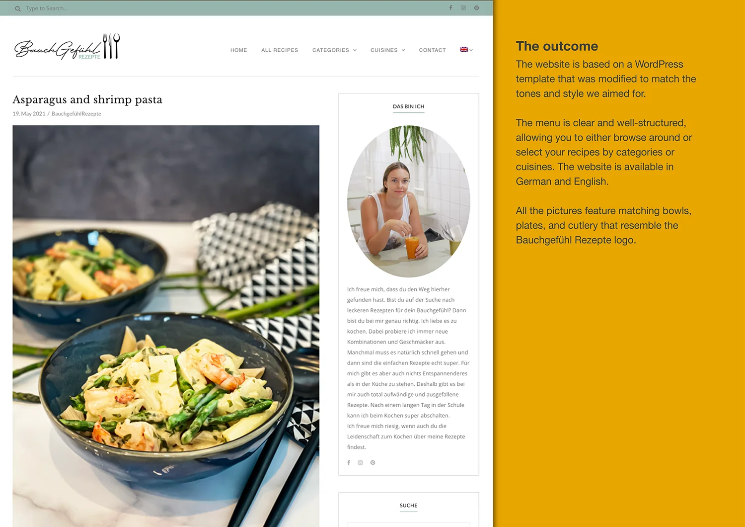
The color palette is intentionally restrained and subtle, completely avoiding flashy or overly playful hues to ground the blog in a serious, sophisticated aesthetic. Furthermore, the menu structure supports this advanced tone by organizing content with precision, dividing recipes clearly by both meal categories and specific international cuisines.
This elegant restraint in the colors, imagery, and layout lets the quality of the cooking speak for itself, fulfilling the goal of a subtle, mature food blog that doesn’t need to scream what it is.