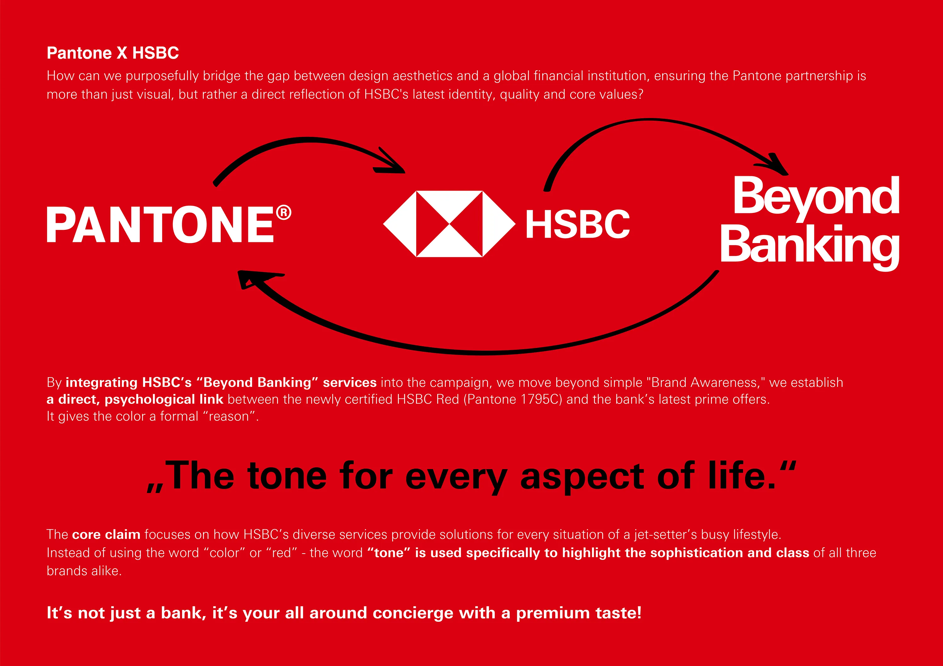
As the first bank in the world, HSBC officially certified its historic brand color with the Pantone Color Institute.
The task of the case study was to develop a global, design-led campaign that claims and celebrates this “HSBC Red” on an international stage.
The core challenge was to differentiate the red in markets where the color is already heavily saturated within the financial sector.
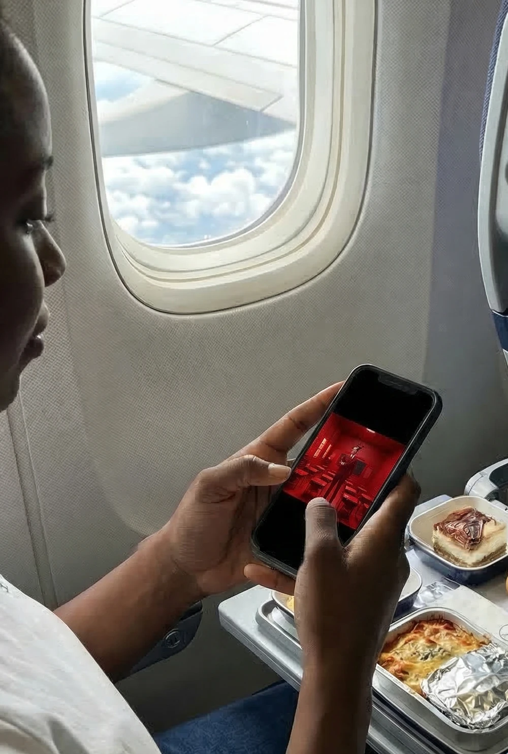
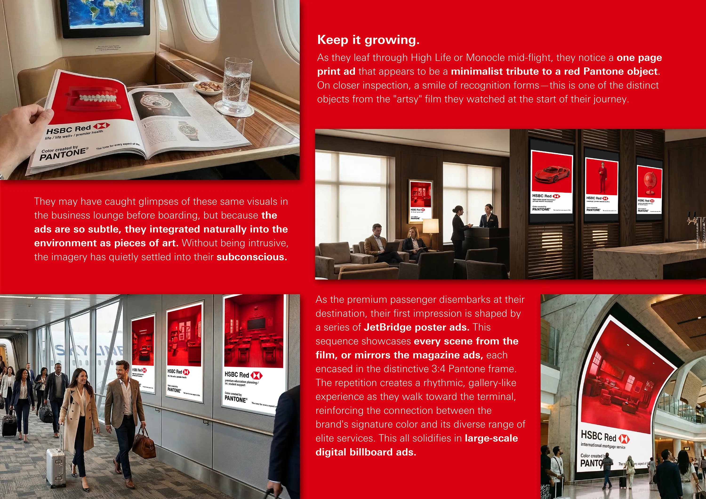
At the same time, the visual identity had to engage a high-net-worth, travel-heavy target audience at a premium level across global HSBC touchpoints, such as international airport jetbridges and walkways.
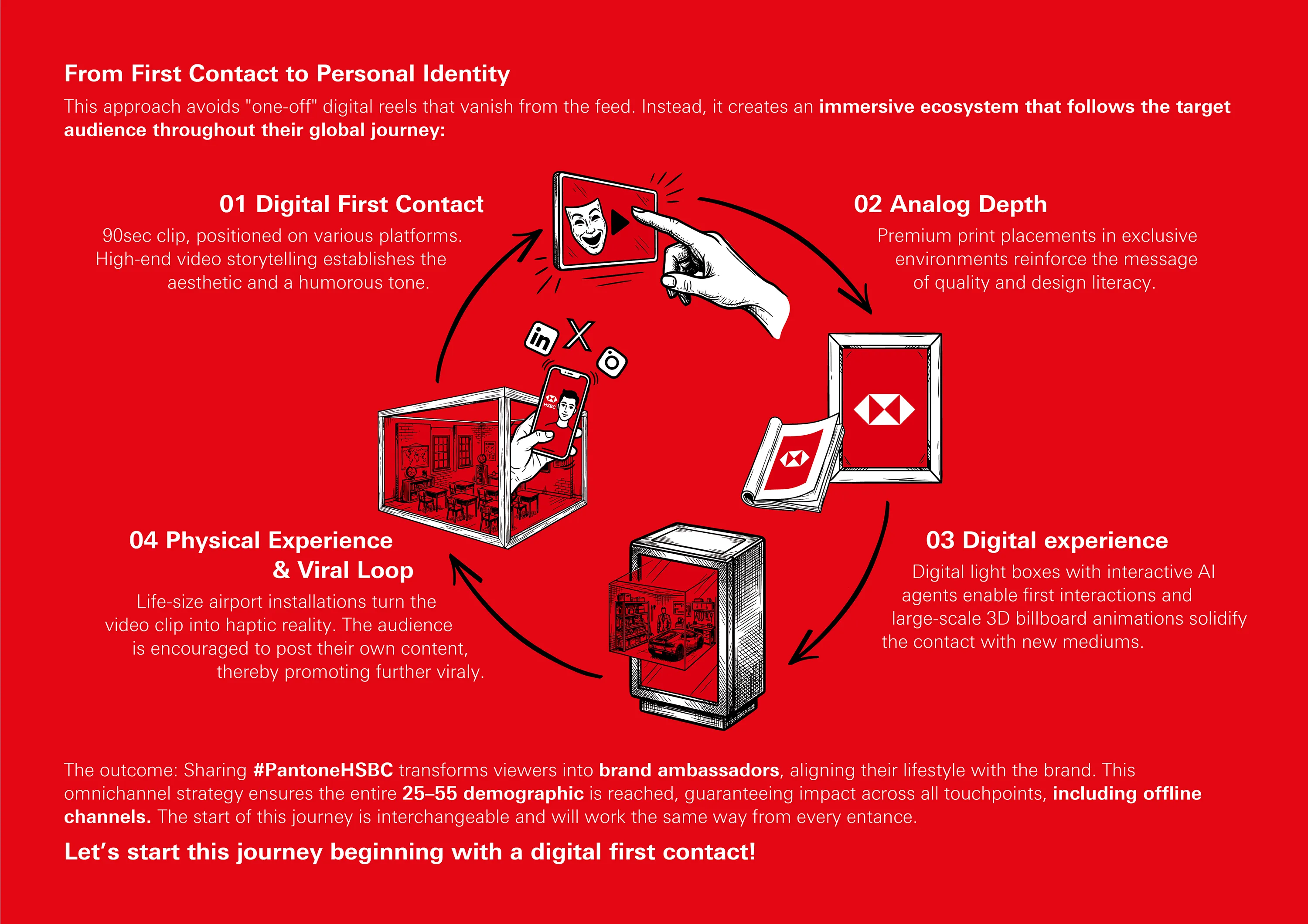
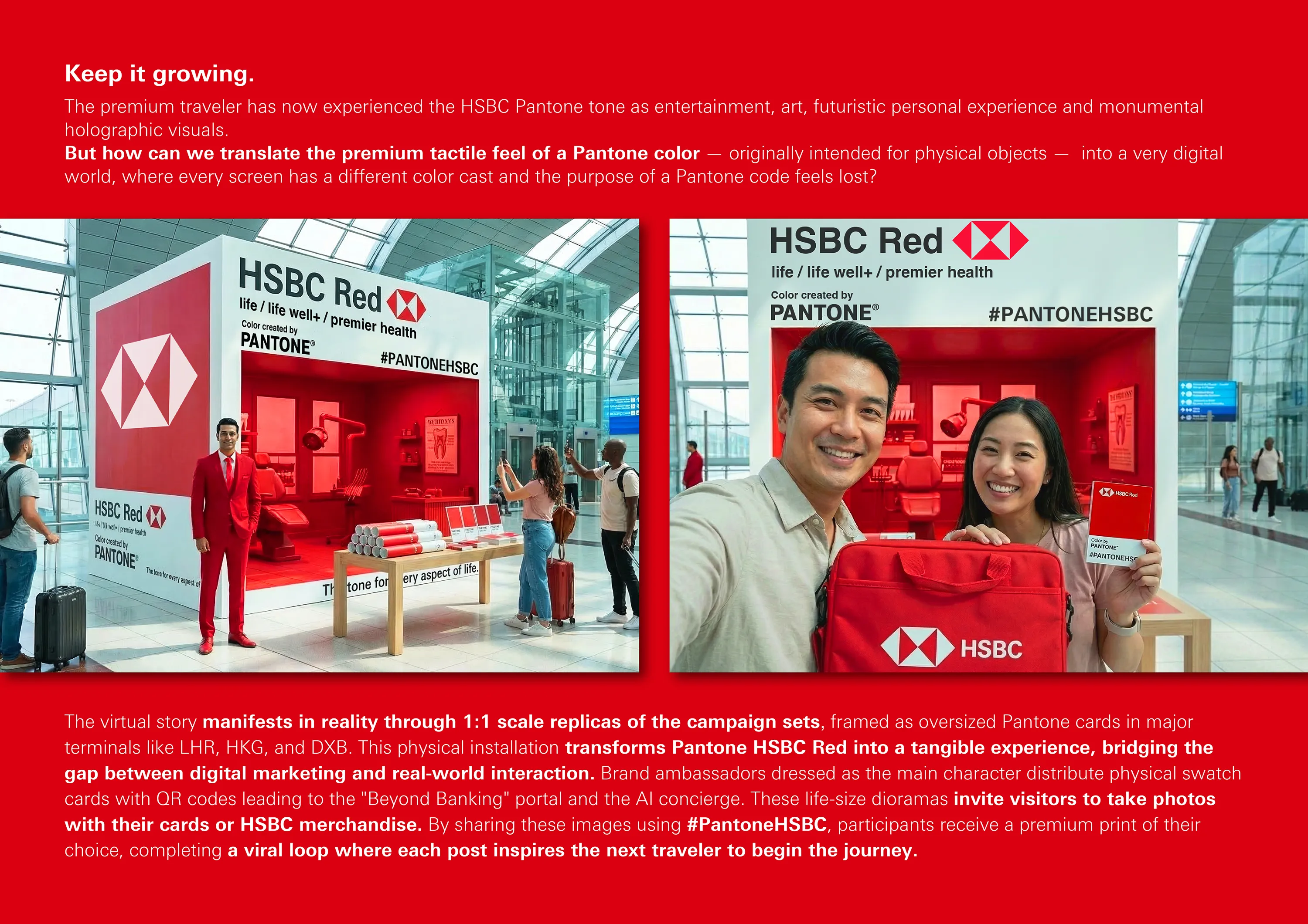
In a world of fleeting digital impressions, this campaign is designed to create a sustainable, high-fidelity memory of the HSBC x Pantone brand, unmistakeably connected with HSBC’s services.
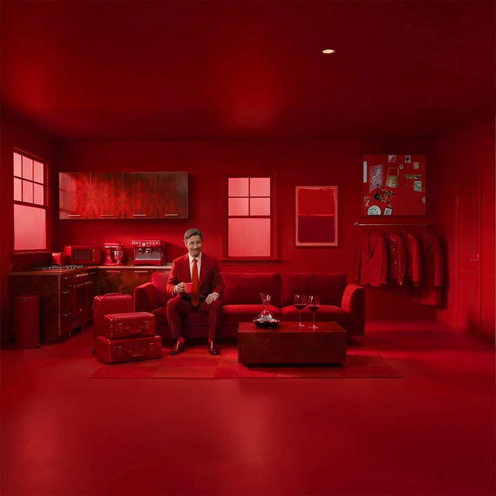
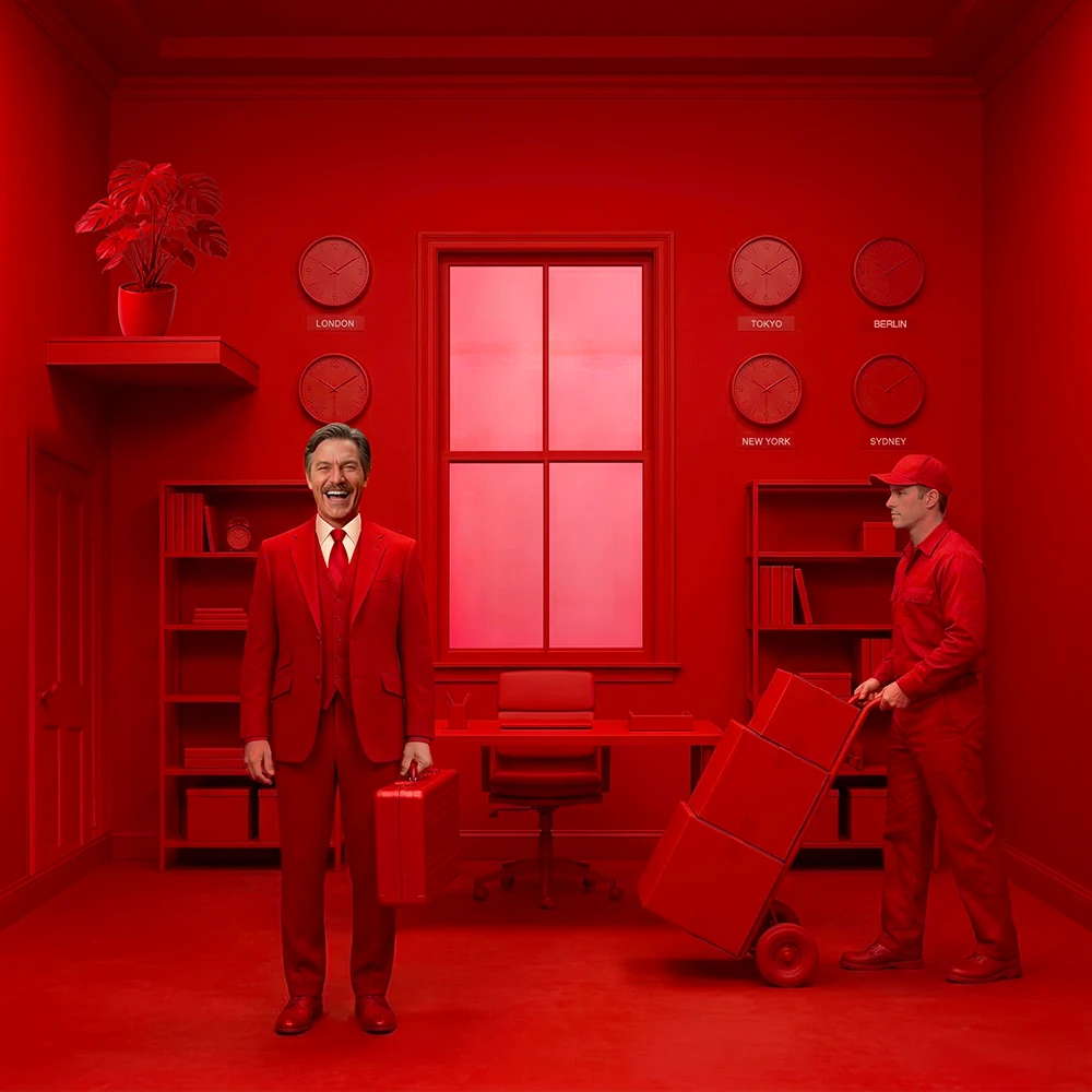
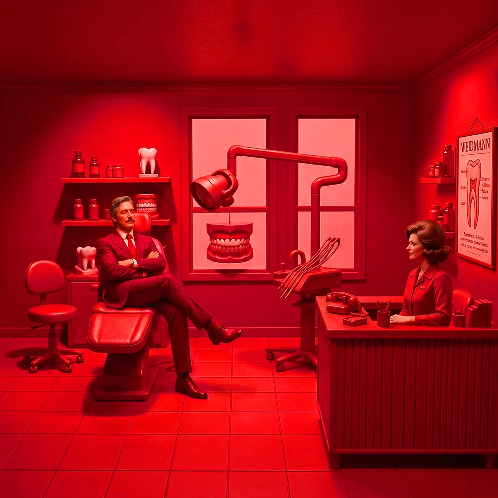
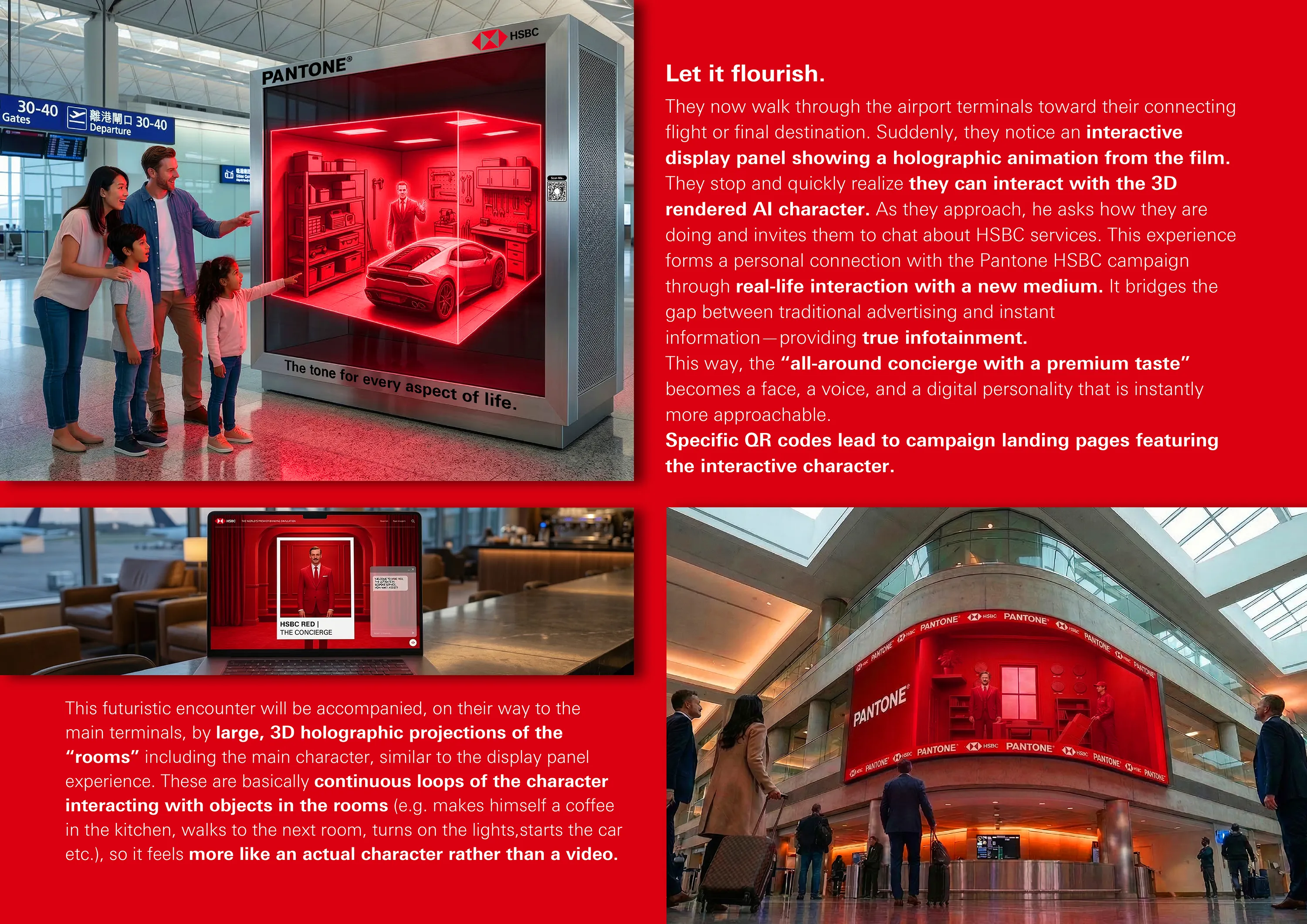
The visual language is minimalist, heightened, set-like, and calm, rendered exclusively in Pantone HSBC Red.
By saturating service-representative objects in this single tone, they become tangible, interesting, and exclusive, creating an immediate link to the service described in the color code label.
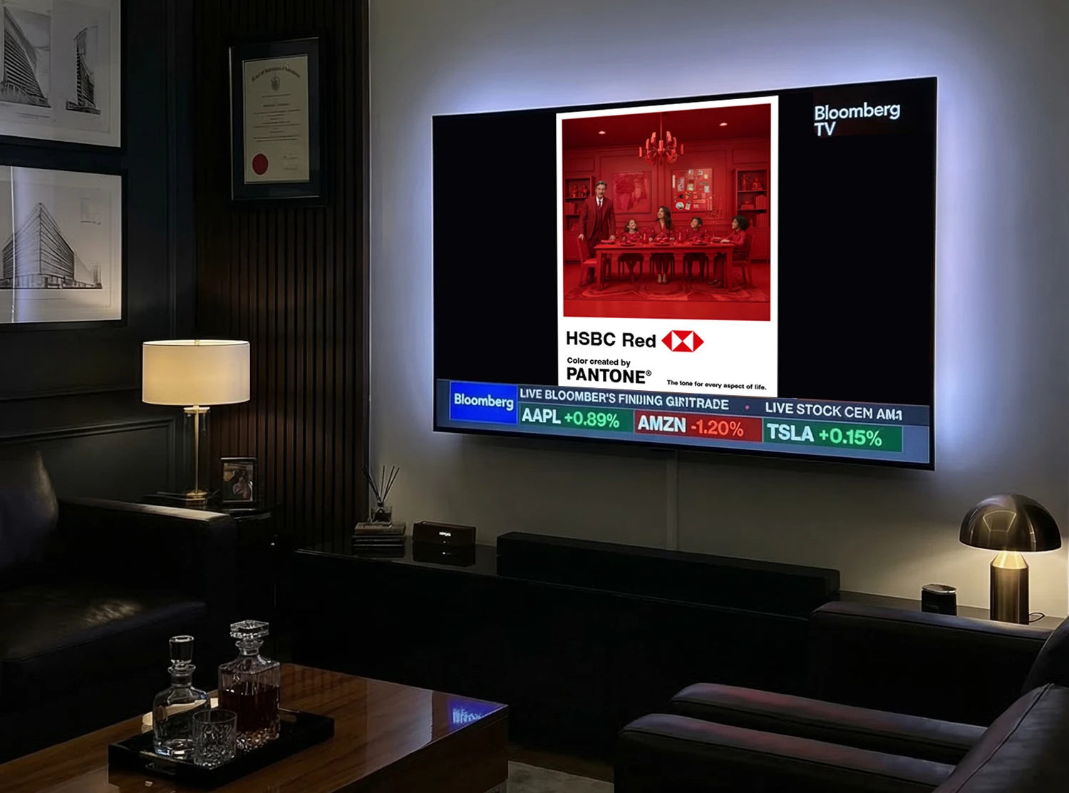
All creatives follow a 3:4 ratio, mirroring the proportions of a Pantone color swatch—a mark of quality and recognition applied consistently across all touchpoints, from billboards to social media.
On wider screens, black pillarboxes maintain these proportions.
The only exception is the video clip, presented in 1:1 to underline the retro aesthetics and optimize the use of the frame.
The aesthetic allows the posters to function as unobtrusive yet powerful brand art rather than traditional advertising.
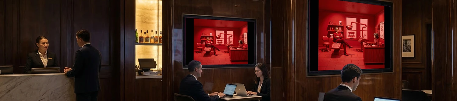
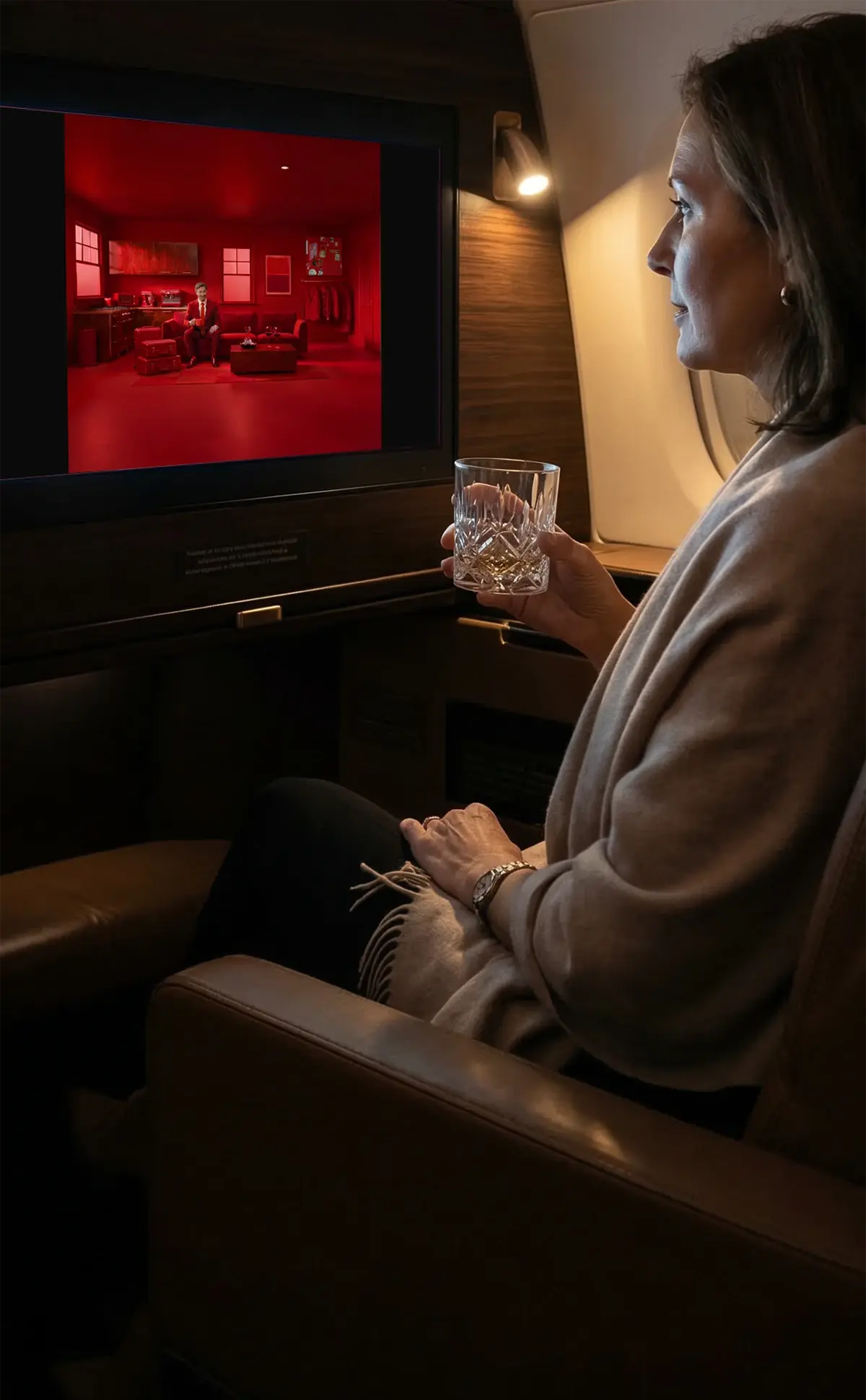
The campaign film (90sec length) will be broadcast through premium digital placements across all touchpoints where High-Net-Worth Individuals (HNWIs) and global decision-makers circulate. First/Business Class IFE, private lounges and FBOs. Bloomberg/CNBC broadcasting, LinkedIn/Instagram targeting and luxury DOOH on all important airports world wide.
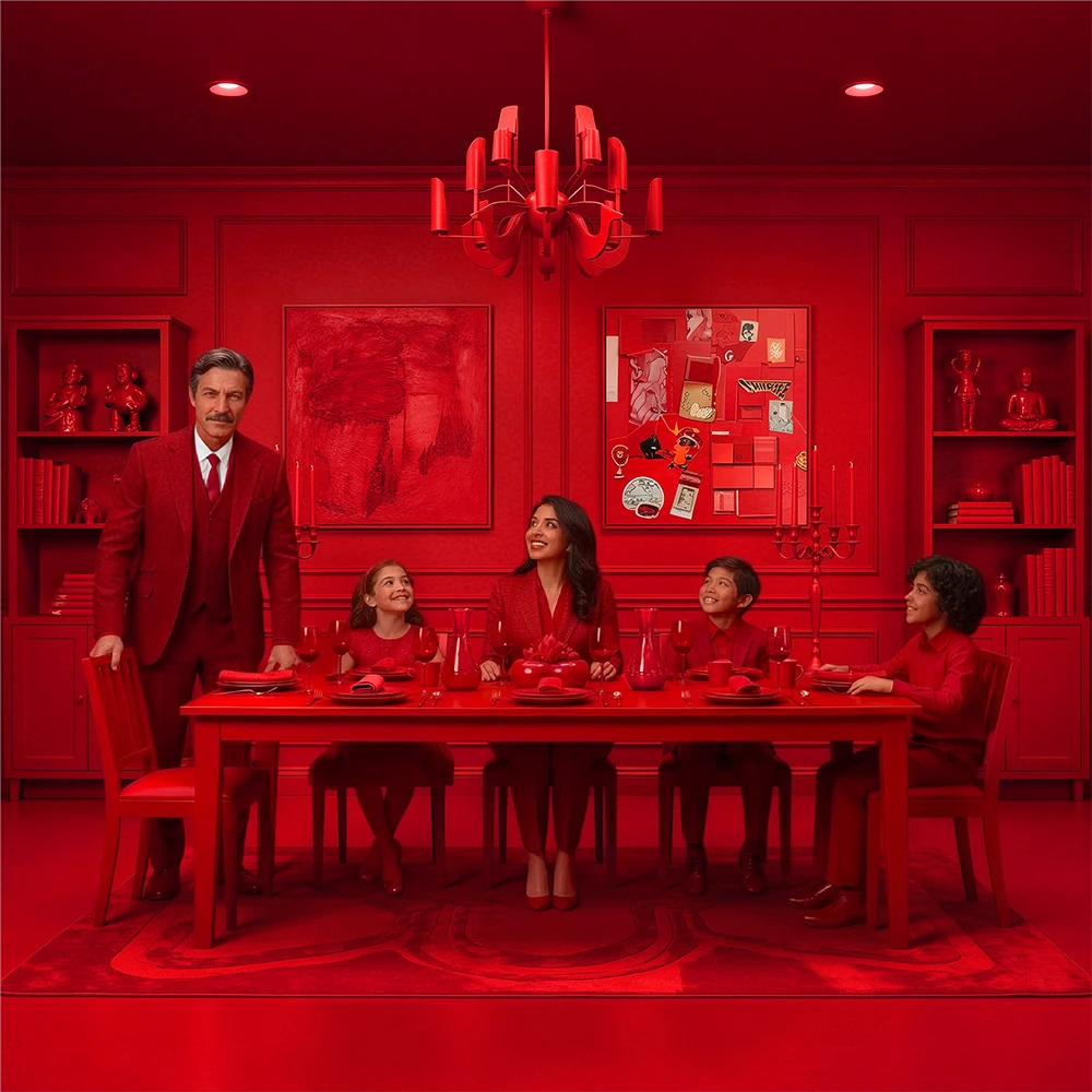
Scene 1 Living Room (International mortgage):
“People ask me why I chose only one single color for every aspect of my life.”
Scene 2 Second Home / Office (International Relocation):
“It provides guidance when I move abroad…”
Scene 3 Dentist (Life, Global Medical Network):
“…and is a tone, that helps me stay calm when it comes to healthcare…”
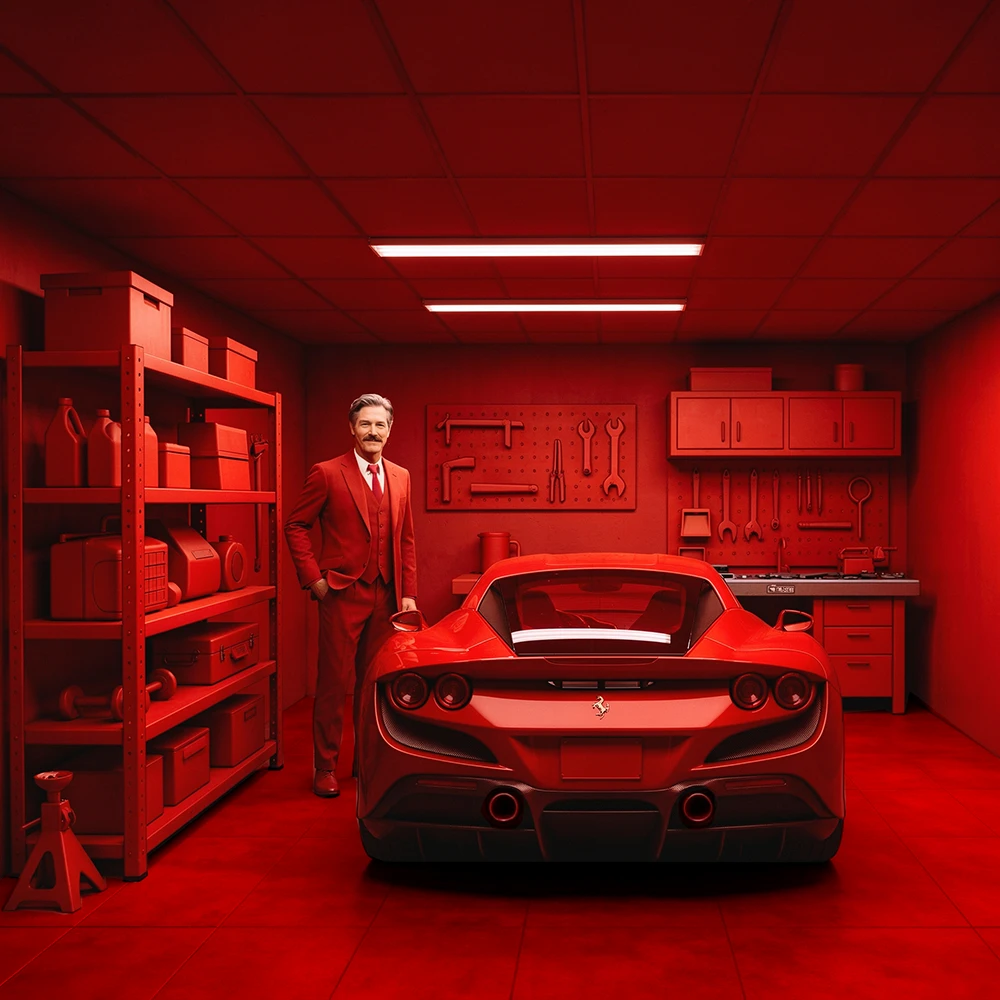
Scene 4 Garage (High-Value Asset Insurance):
“…and makes me feel secure about my investments…“
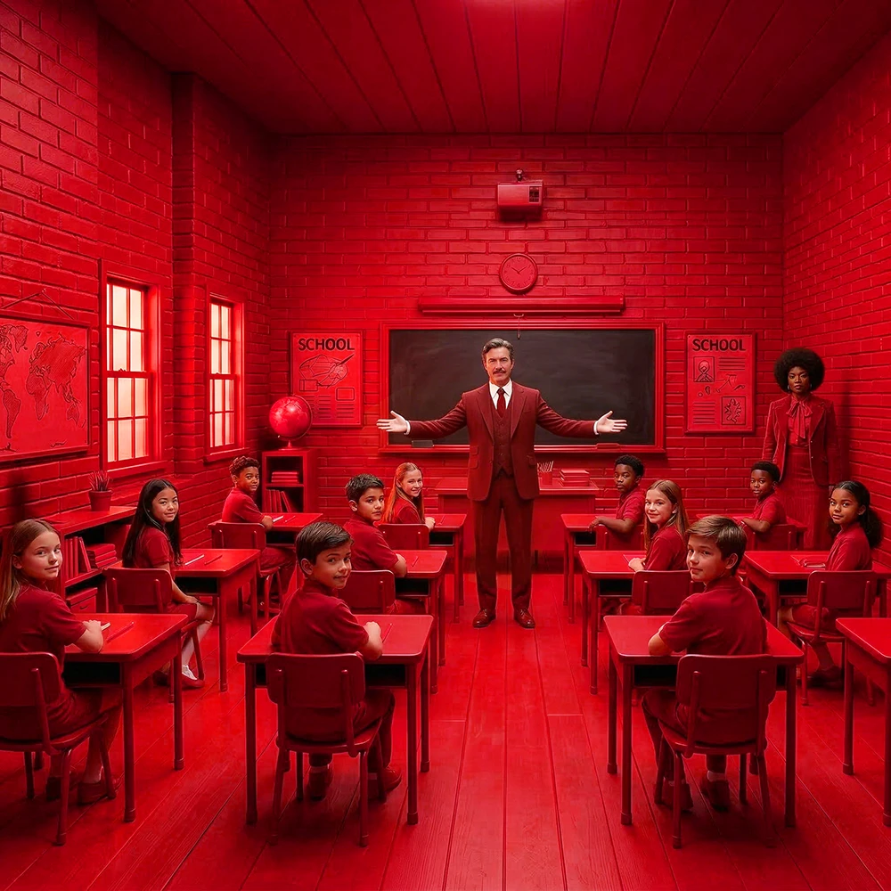
Scene 5 In Class Room (Premier Education):
“And also, this specific red is proven to elevate educational standards!”
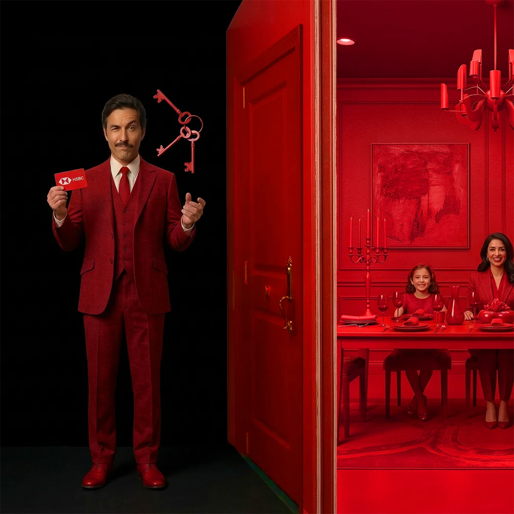
Scene 6 (The modern partner):
“There are colors for anything…” He holds three red classic keys – none fit. (A subtle nod to competitor UBS). He tosses them away, takes out a HSBC keycard, and opens the door. “…but only one tone for everything.”
Ending (Legacy):
He enters a living room where his whole family awaits him. The camera zooms out until the entire scene sits perfectly within the top square of a Pantone Color Swatch.
Theatrical, monochrome HSBC Red interiors featuring a main character in a
Wes Anderson-inspired tableau vivant. He moves from scene to scene while the camera follows.
The backgrounds and props change as he goes, like in a theatrical scene-change.
In January 2026, I decided it was time to start using my skills for other clients ither than my own company.
Since I hadn’t worked in the advertising industry for 17 years since completing my degree, it was incredibly important for me to demonstrate my actual capabilities.
Having never even heard of D&AD before January 2026, I stumbled upon the New Blood Awards while looking for a way to build a fresh portfolio. Remembering the success I had winning student competitions during my university days, I knew that tackling an actual brief would be a great approach.
I chose the HSBC x Pantone simply because I felt it was one of the more complex ones to explain, and I wanted that specific challenge.
Due to various circumstances, I wasn’t able to start working on it until the end of February, leaving me just two and a half weeks to develop the entire concept and final execution before the March 17th deadline.
All imagery and video components were generated using various AI tools, refined in Photoshop, and assembled in Adobe Premiere Pro.
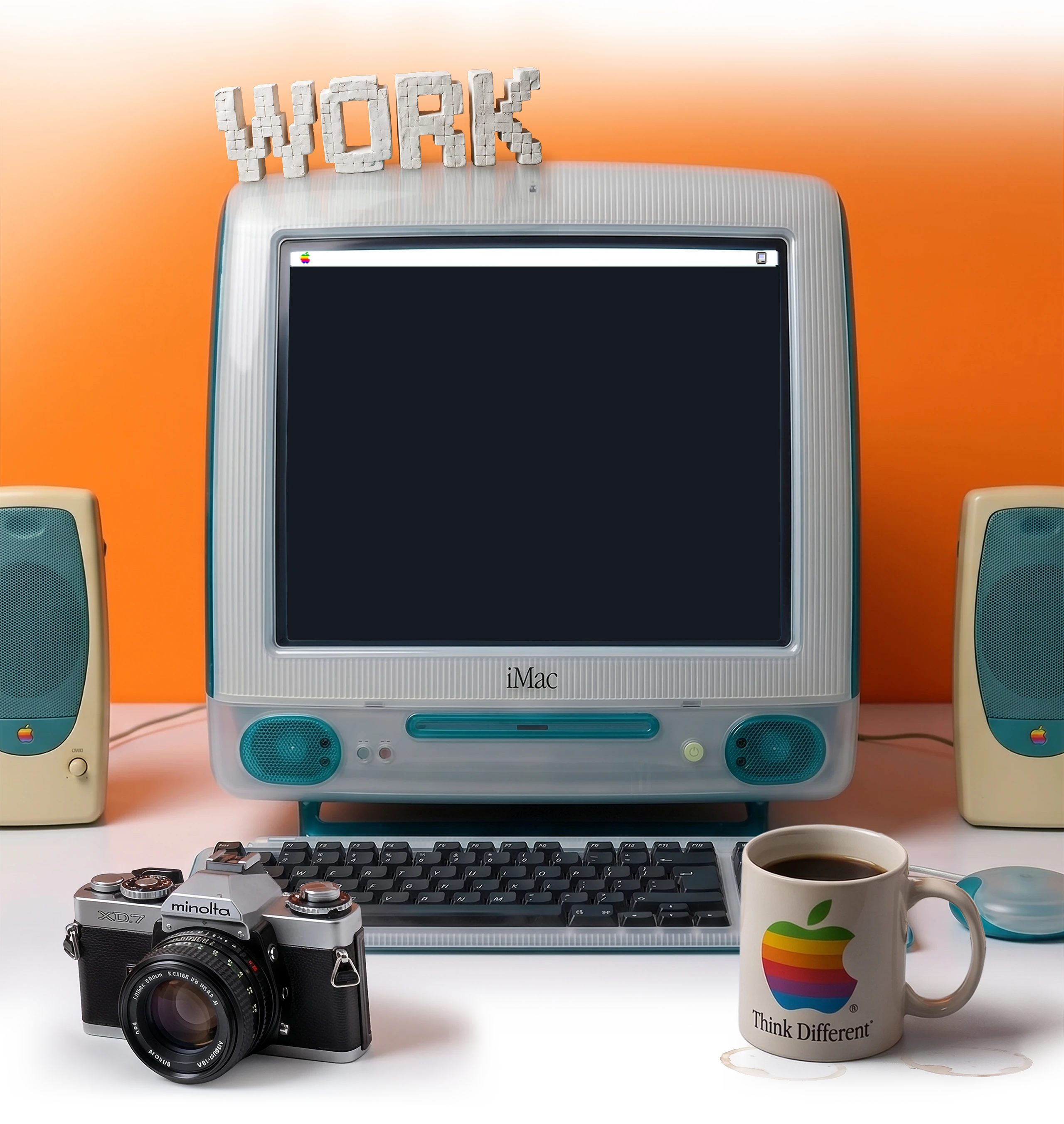
As a D&AD newblood pencil winner, you could send in a reaction video of you, receiving the good news.
The task was: be creative within roughly 15 seconds – so I did and here is my reaction clip.